Album Cover
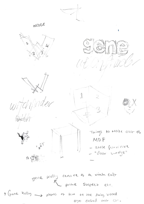
Band Name: Gene Kelly Witchfinder General
Album Name: Wedge Addiction
Genre: Britpop
Album Name: Wedge Addiction
Genre: Britpop
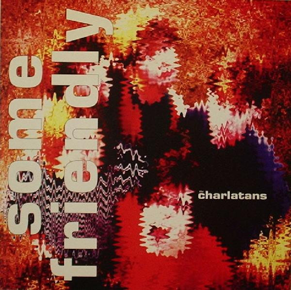
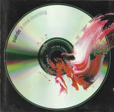
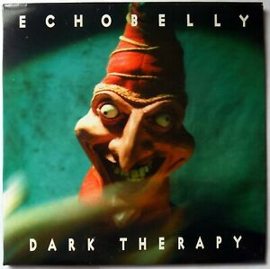
I created a basic moodboard on Britpop artists and vinyl album covers as a starting point to help distinguish any key themes and features specific to Britpop. I noticed that most of these bands used similar fonts for the logo of their band - either a sans serif Helvetica or a loopy, handwritten/calligraphic font.


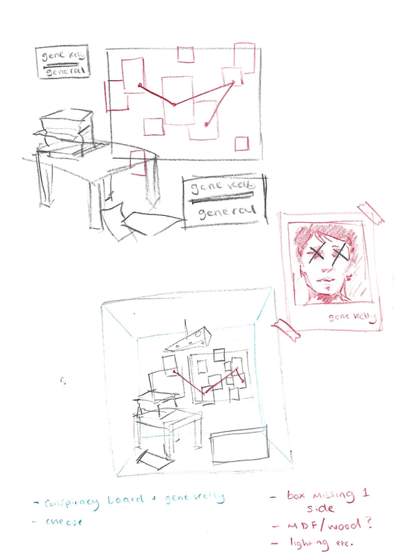
I began brainstorming ideas for visuals and motifs that the name of my band and album title made me think of. Since the final product was to be inside a cube, I made my thumbnail ideas sit in a three-dimensional space and considered how I may represent this and if I would include all faces of the cube (or all walls of the box).

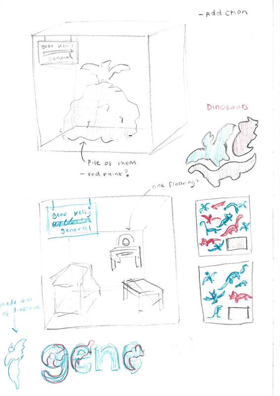


When looking at my moodboard, I was heavily inspired by the album covers that included lots of Things and Objects either seemingly randomly or with a theme. I specifically liked Oasis's Dig Your Heart Out cover. The collage style reminded me of The Beatles Sgt. Peppers and I began getting inspired by how I might create a collage effect with three-dimensional objects instead of using photoshop or any other digital software that I am so used to and much more familiar with. It made me consider effects I might be able to create that I wouldn't think of when working digitally - for example, the ability to utilise shadows and lighting (or lack of them) and to be restricted by a small cubed space as well as just basic things gravity and working out how to position objects at different angles without them falling over. I started to get excited that it could create a tactile and hand-made look whilst also appearing sophisticated and polished enough for an album cover that would encourage someone to pick up the album and buy it.
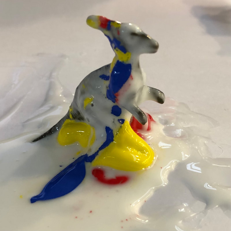
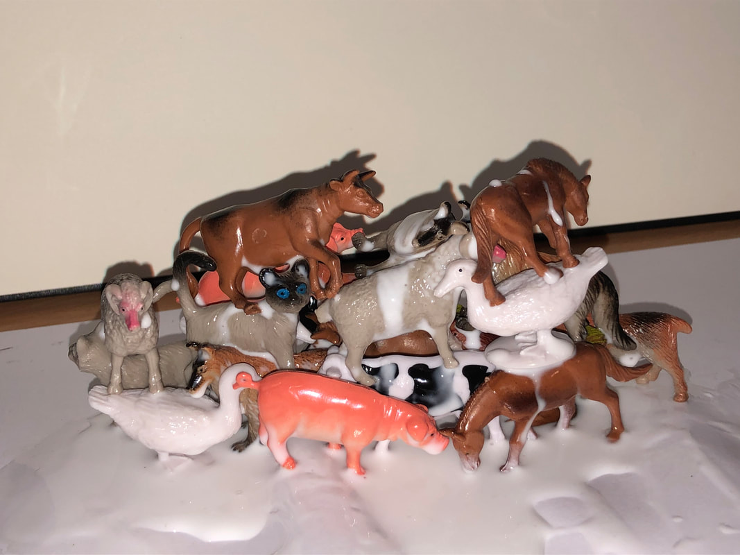
During this experimental stage, i was inspired by concepts but didn't have any solid ideas, so I went to B&M and just explored the toy section for cool and interesting things. i was enamoured by some little boxes of plastic farm animals and plastic dinosaurs because I used to love playing with them as a kid and I liked how ugly and odd they all looked due to cheap paint jobs and all of them being disproportionate to one another - the cat was bigger than the cow! I wanted to use them to make something equally odd so I started piling them up with glue and drowning them in paint to see what it did. I attempted to build a pile of farm animals and was happy when peers who walked past my work station would catch sight of it, stop and say, "WHAT is that?" and "WHY are you doing that?" because that's exactly the reaction I wanted to create and tone I wanted to give my album cover.
During this experimental stage, i was inspired by concepts but didn't have any solid ideas, so I went to B&M and just explored the toy section for cool and interesting things. i was enamoured by some little boxes of plastic farm animals and plastic dinosaurs because I used to love playing with them as a kid and I liked how ugly and odd they all looked due to cheap paint jobs and all of them being disproportionate to one another - the cat was bigger than the cow! I wanted to use them to make something equally odd so I started piling them up with glue and drowning them in paint to see what it did. I attempted to build a pile of farm animals and was happy when peers who walked past my work station would catch sight of it, stop and say, "WHAT is that?" and "WHY are you doing that?" because that's exactly the reaction I wanted to create and tone I wanted to give my album cover.


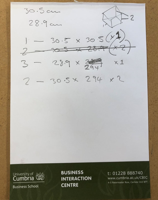
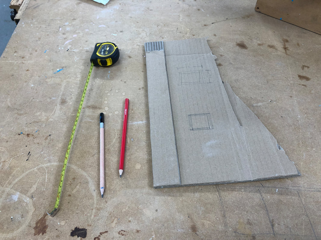
While playing with the plastic animals, I realised it would be important to prepare the actual 12" x 12" cube to give me a better idea of scale and size. I decided I wanted it to be a sturdy wood so that I'd be able to glue and hang things from it if necessary and also because I knew there would be plenty of spare (and free) wood available to use in the wood workshop. I visited the workshop and got some help from Kenny when working out the dimensions for each side. The side pieces had to be shorter along the height to account for the thickness of the material (8mm) and the back piece had to be shorter on both the height and width. Once the measurements were worked out, each side was cut using the lathe.

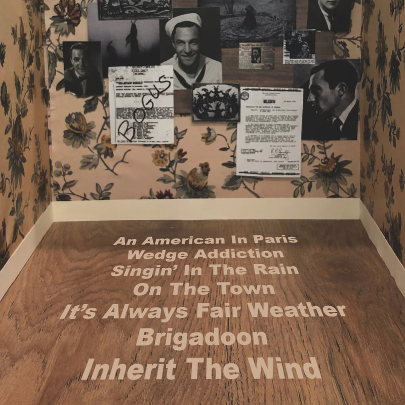
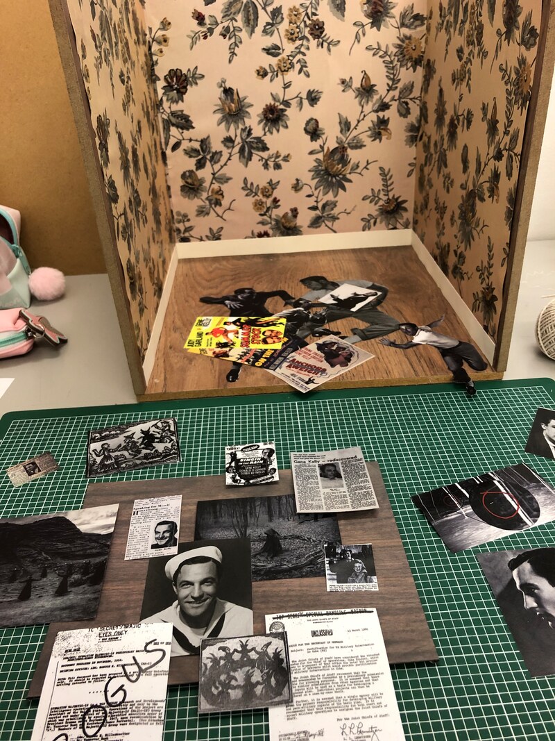
Following the theme of "Gene Kelly" and the aesthetics that provoked in my mind, I decided to use 1950s inspired wallpaper to decorate the "walls" of the room. I felt this would tie all the themes together as well as establishing the tone of the room - vintage, with a lot of browns and creams.

I decided to add a skirting board using some cream card to properly finish the wall - both making it much neater and also creating further likeness to a real wall.


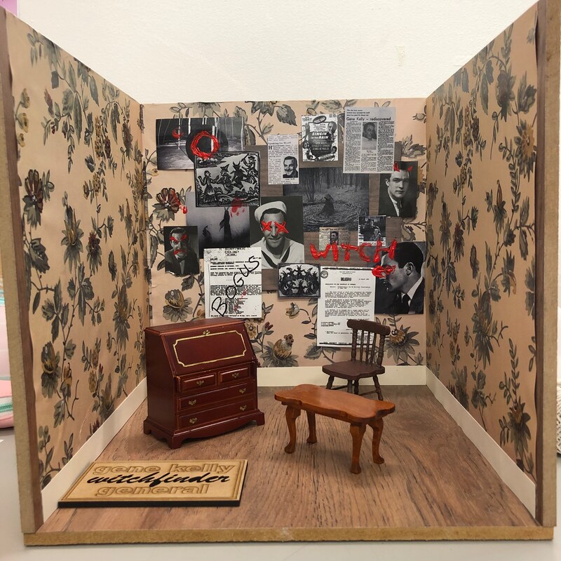
The final album cover:

I was very pleased with the outcome of the final piece, it managed to capture the random hand-made look that i wanted as well as still being a convincingly sophisticated album cover.
I also experimented with making a back cover for the album with a tracklist. I did this very quickly as an afterthought so I just took an earlier progress photo and added text in photoshop.
I also experimented with making a back cover for the album with a tracklist. I did this very quickly as an afterthought so I just took an earlier progress photo and added text in photoshop.