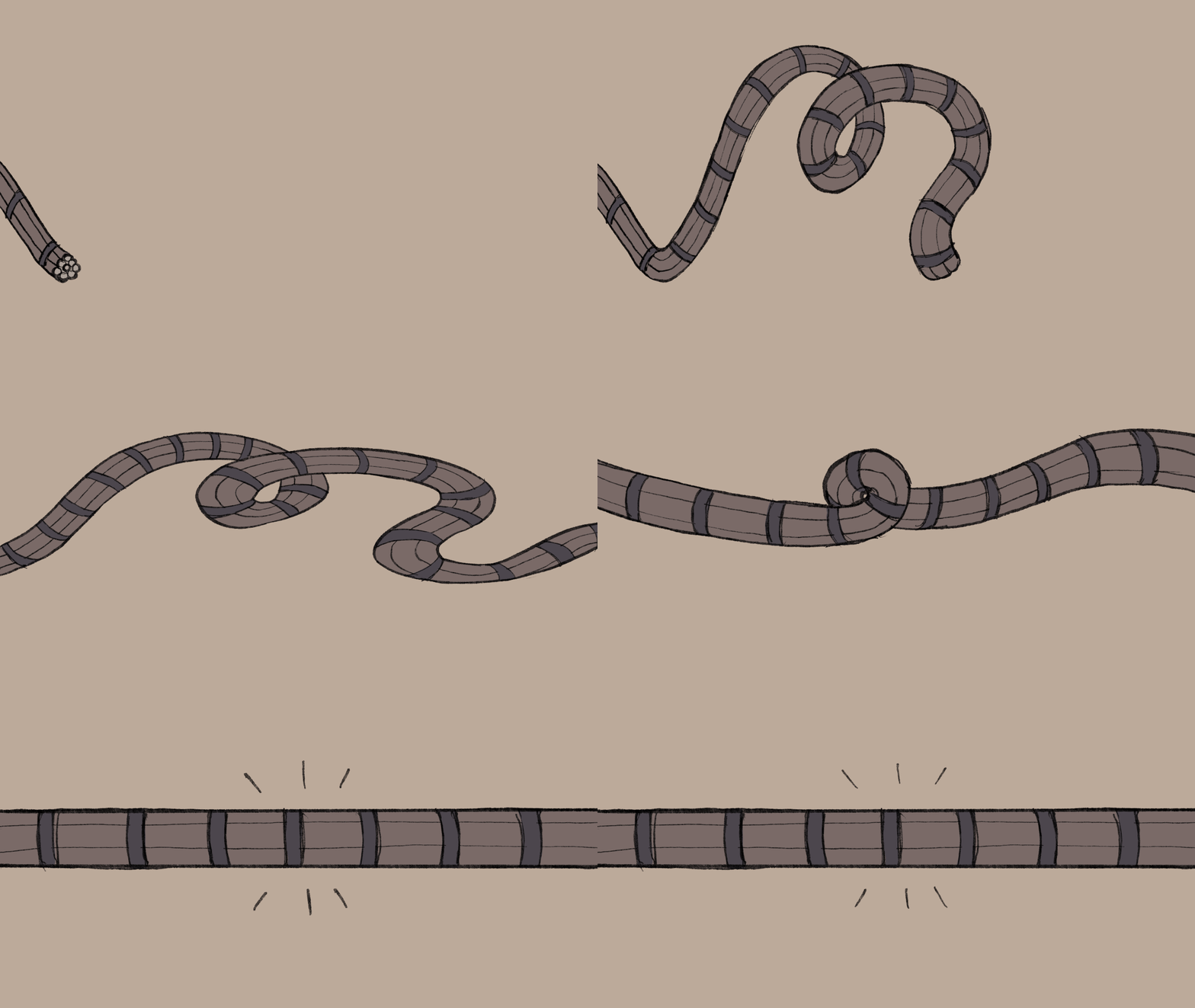
For this brief I am going to "clarify the complex" in a short animation. My assigned topic was "How Was The Brooklyn Bridge Built?"
- Who is the intended audience?
- How much work do you need to do in order to convey your intention?
- Where are the opportunities to add extra value?
- Who is the intended audience?
- How much work do you need to do in order to convey your intention?
- Where are the opportunities to add extra value?
I decided my intended audience would be primary school aged children (7-8 year olds) who may be doing a class project on The Brooklyn Bridge and would need summarised information about the subject presented in a short video to watch as a class.
RESEARCH - Brooklyn Bridge
|
|
|
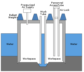
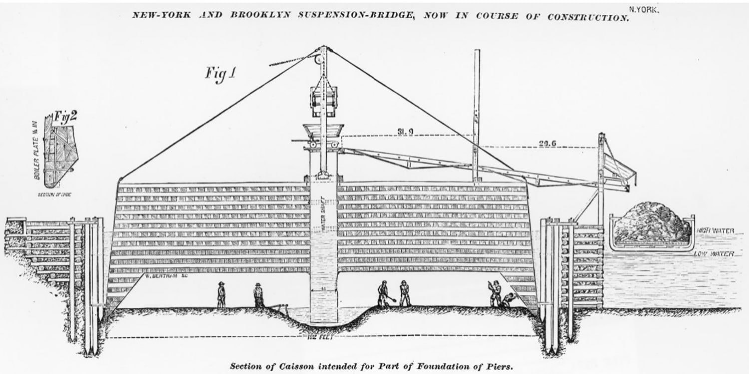

SCRIPT
After my previous animation project, I learned that the script would need to be approximately 150 words to be under 1 minute. It was a challenge to include all the information and present it in the way that I wanted with such a short word count. The script below that I sent to my narrator ended up being 200 words but I learned last time that some editing of the audio (removing breaths and pauses, cutting words together where possible) would help bring the run time down again too.
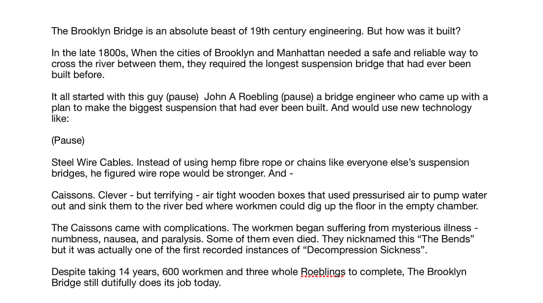
RUN TIME: 1min 30seconds (too long)
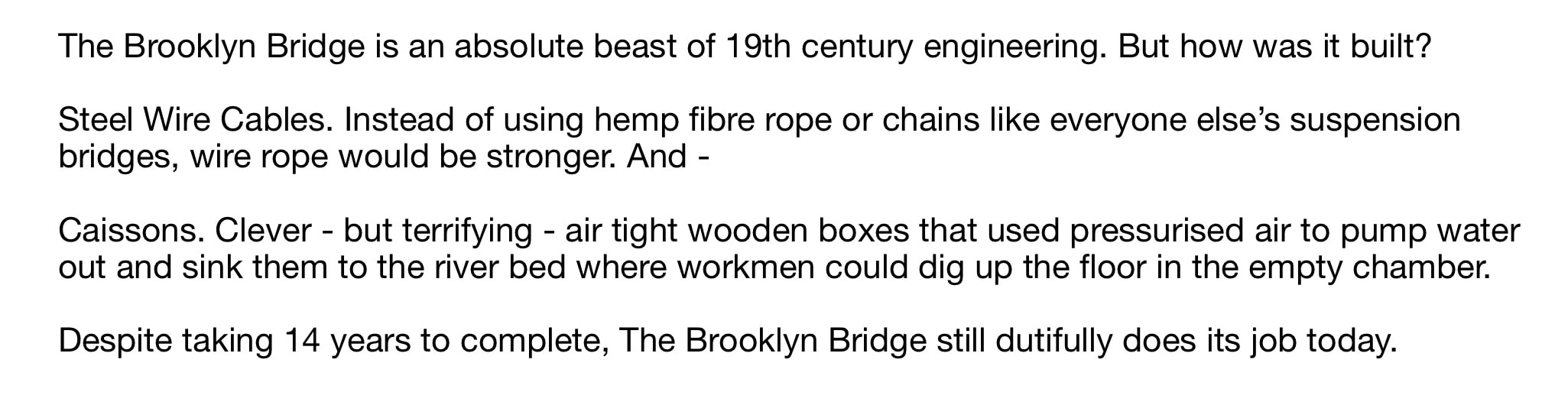
Revised Script
|
RUN TIME: 39seconds
|
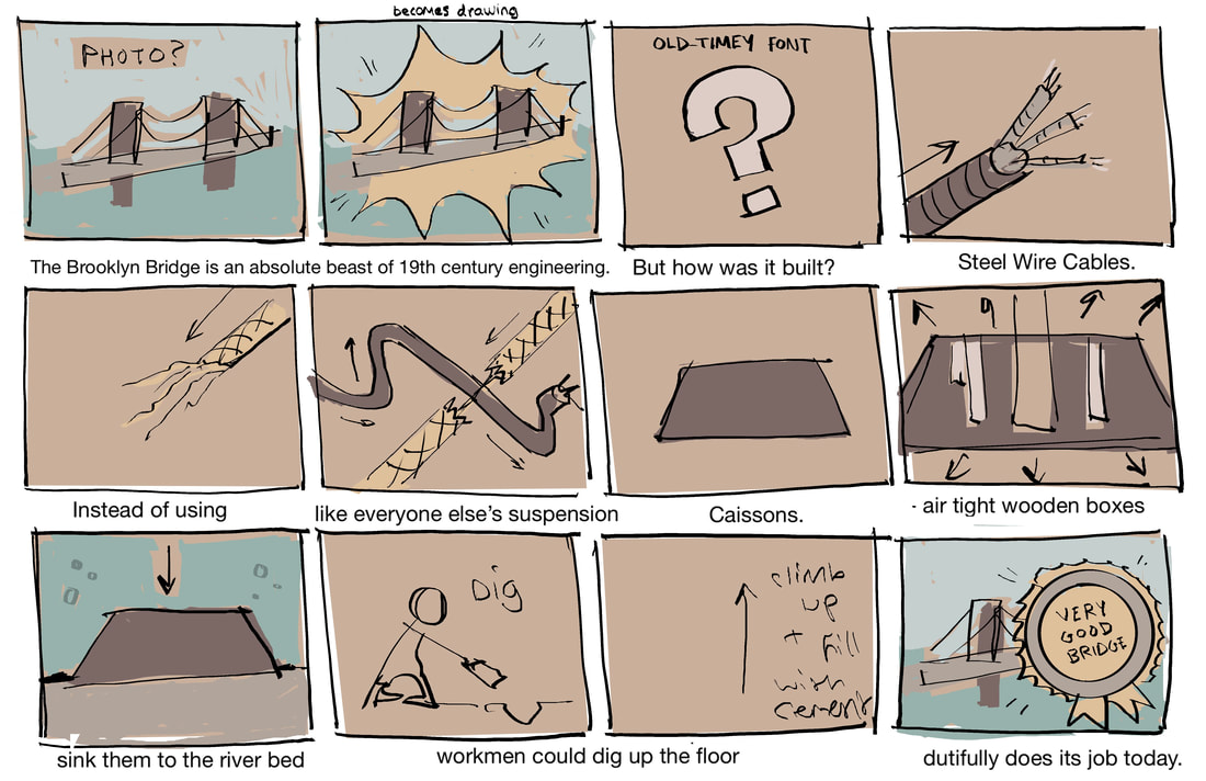
STORYBOARD
ANIMATIC / ROUGHS
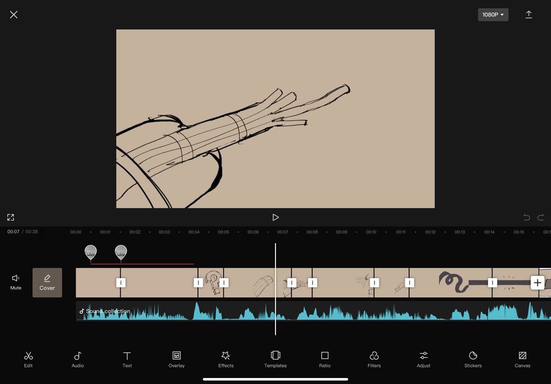
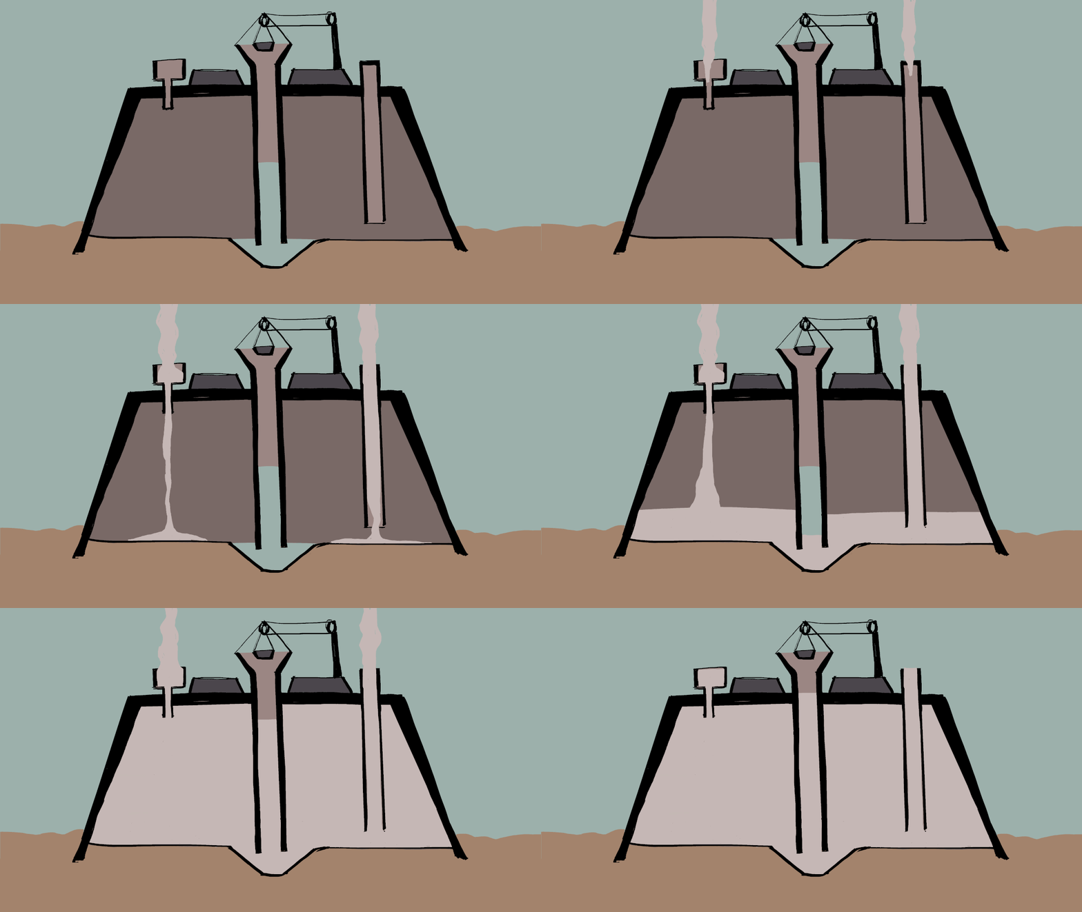
I began by adding rough thumbnails/rudimentary animations to the audio to figure out the timing and where to add each sound effect.



TYPEFACE
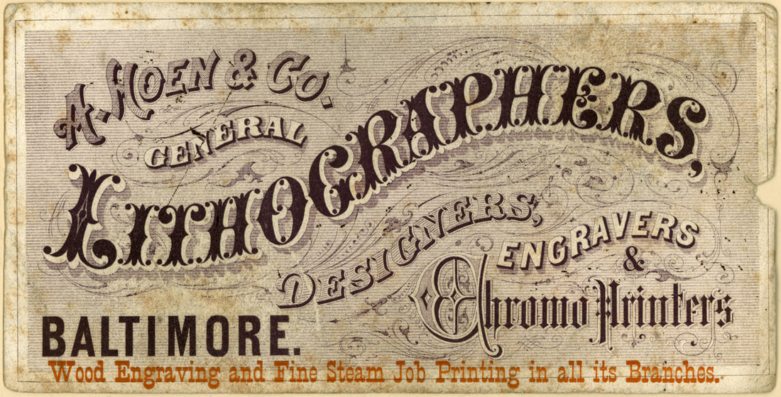
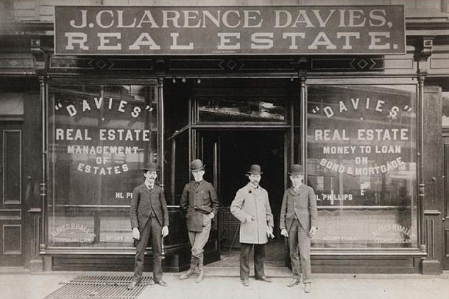
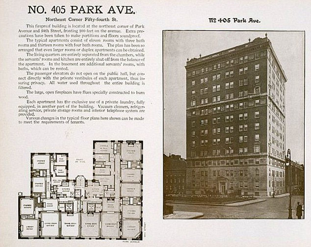
I wanted my animation to have a direct link to the time period it was talking about so I had a look at “old-timey” late 1800s fonts for the captions and on-screen information.



VISUAL STYLE
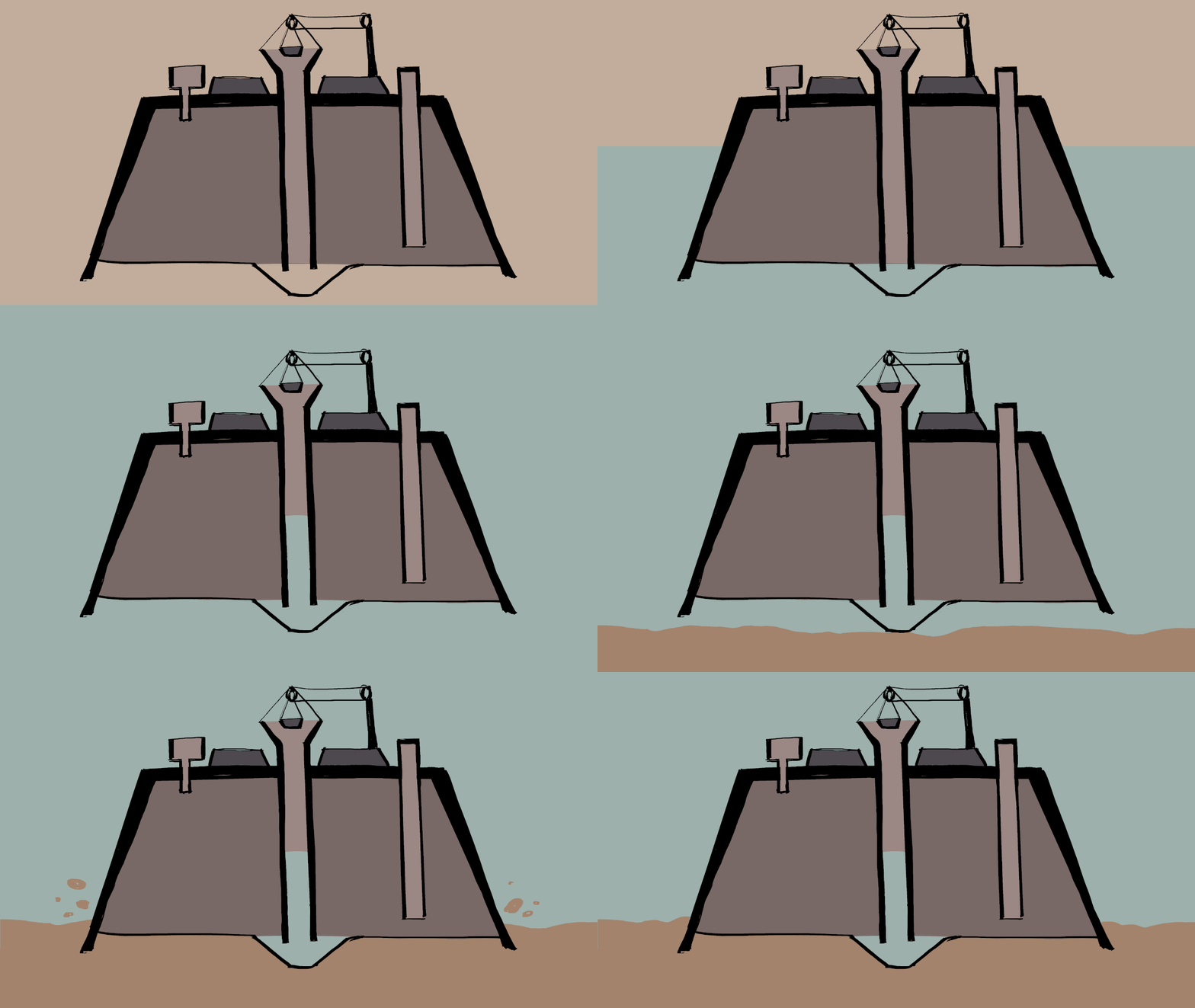
I had been intending to use “my” style for the animation, the same style as the previous Neanderthal animation I made, but then I realised I wanted to lean into the “old-timey” look and decided to use a pencil brush to give a more rustic, traditional look.
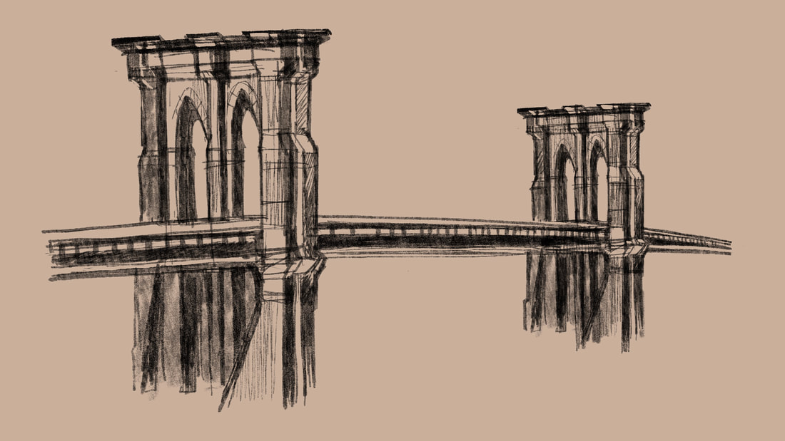
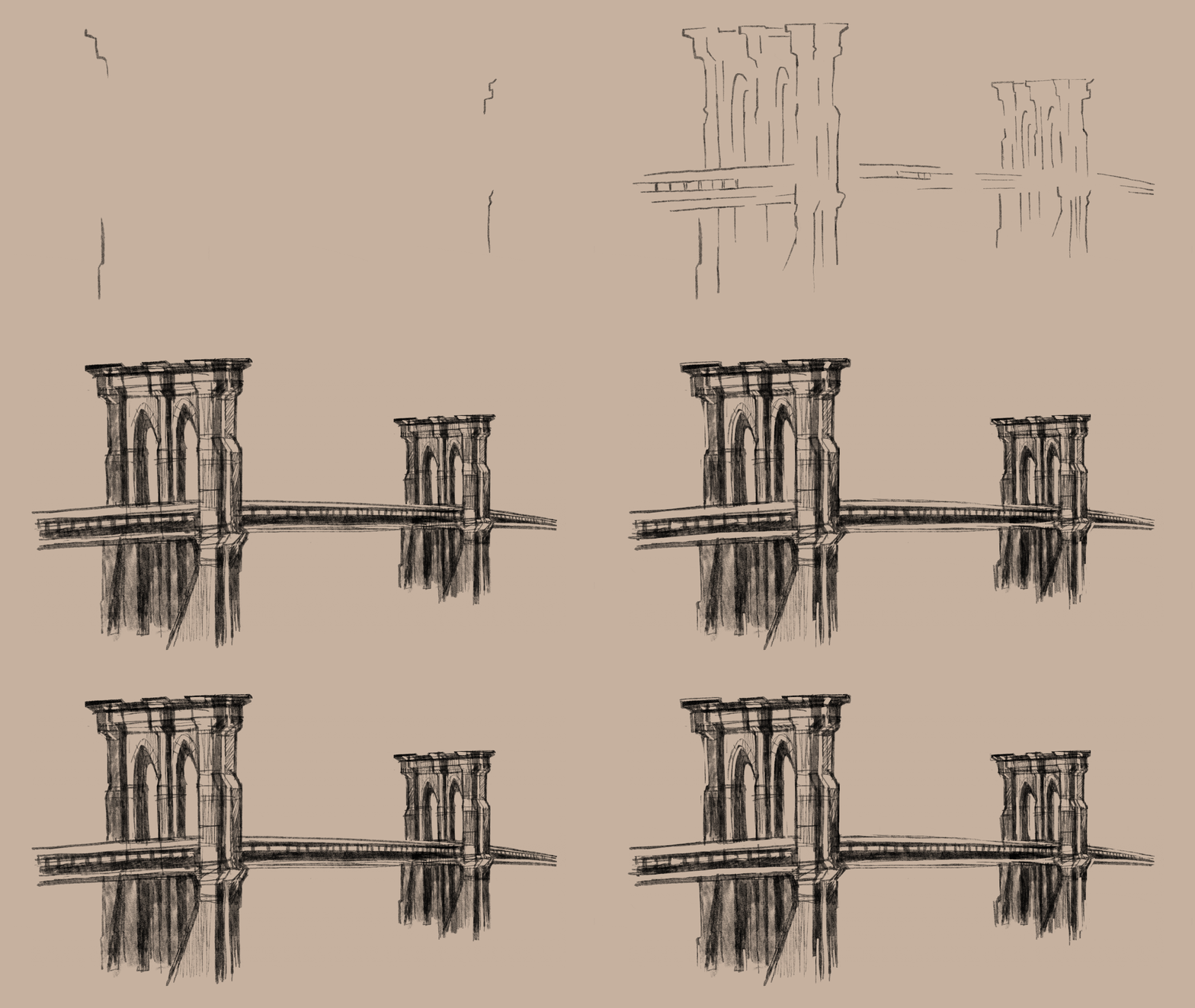
I began refining my rough animation and experimented with combining the sketchy style with flat colours, like my usual style.

I think the flat colours look a bit out of place with the sketchy line style but I cannot decide if the juxtaposition is effective in describing the rigid texture of the steel cables or just distracts from the overall “hand-made” aesthetic.