WEEK 5-6: Photoshop
Photoshop deals with bitmap images, which means that photoshop images are made up of pixels. PSD files can become very large because each pixel has to be individually handled/stored. The nature of bitmap images means that they are especially good where texture and tone is key. Bitmap is not ideal for creating very large images or for creating work where upscaling may be required.
Bitmap (or raster) images are stored as a series of tiny dots/pixels.
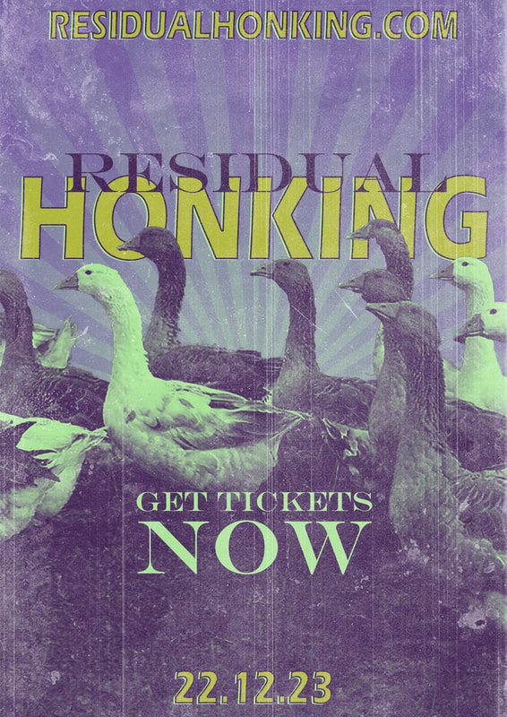
Assigned Band Name: Residual Honking
Bitmap (or raster) images are stored as a series of tiny dots/pixels.
Assigned Band Name: Residual Honking
Victor Moscoso
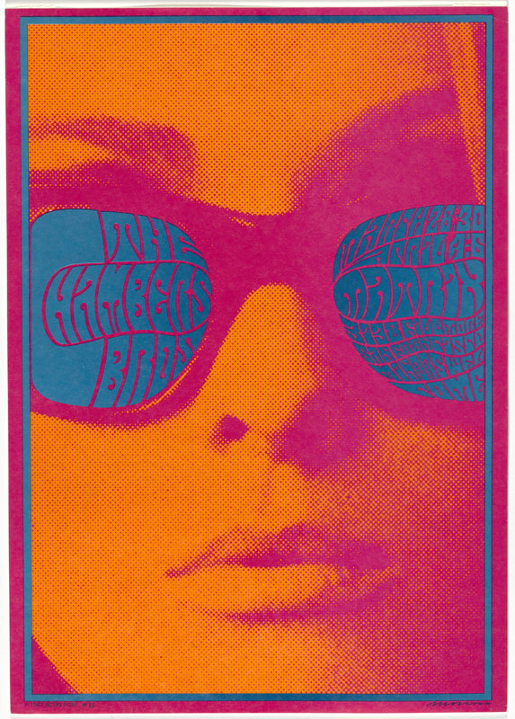
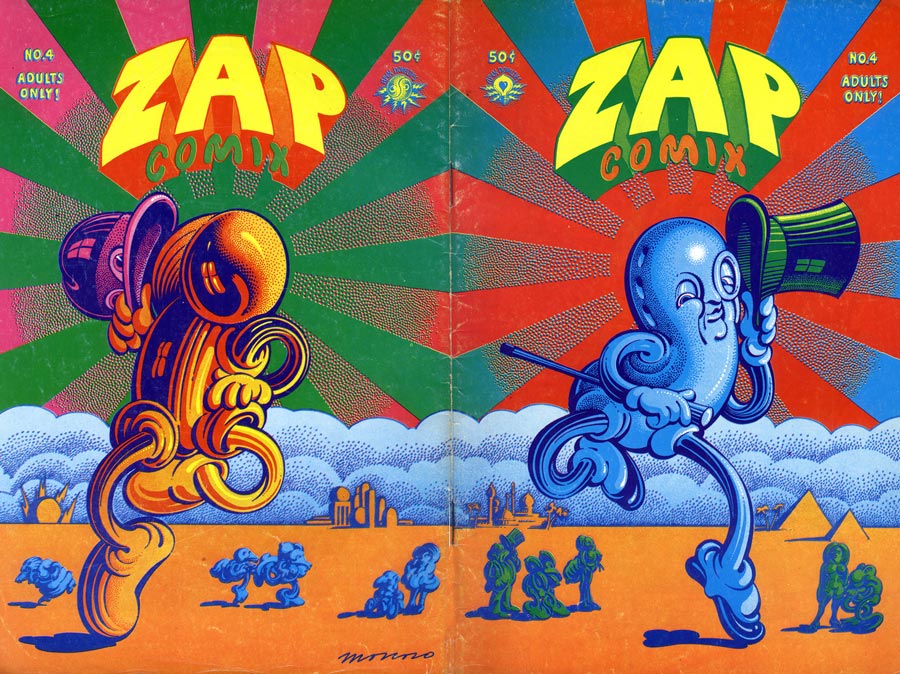
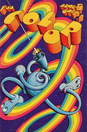
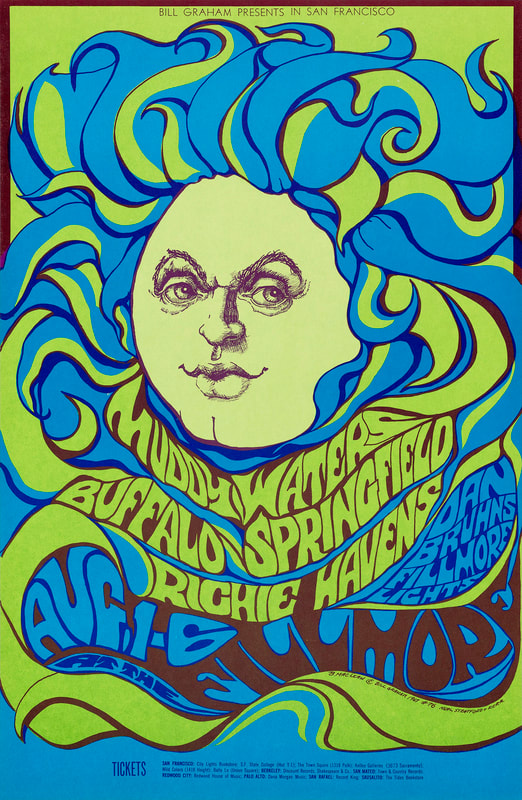
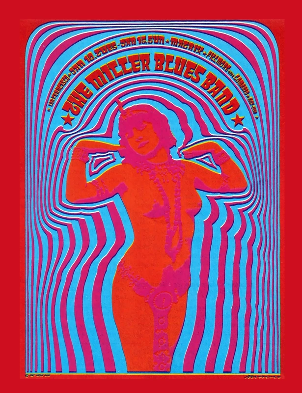
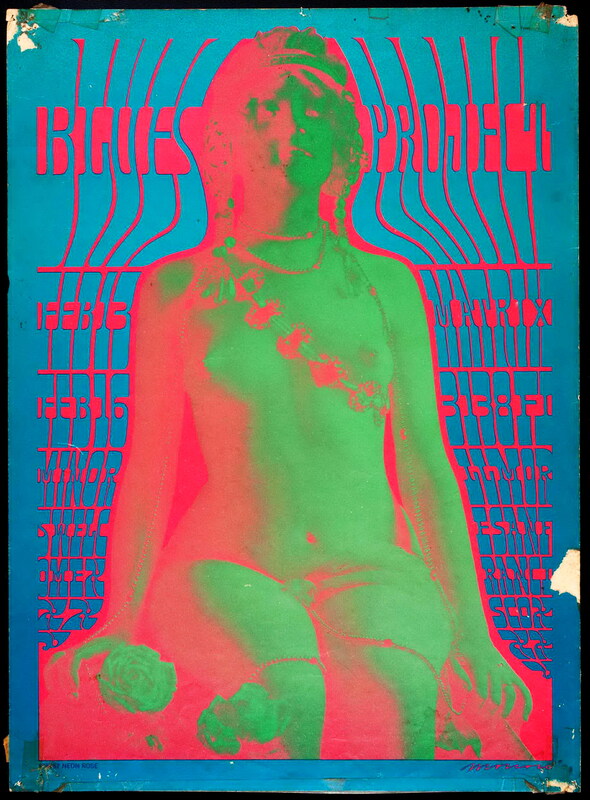
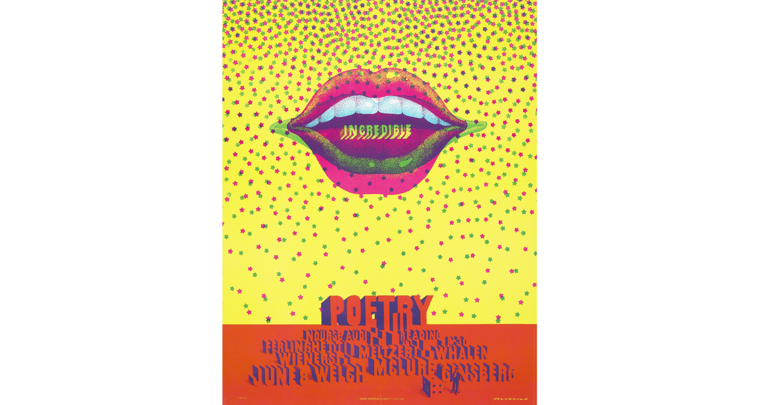
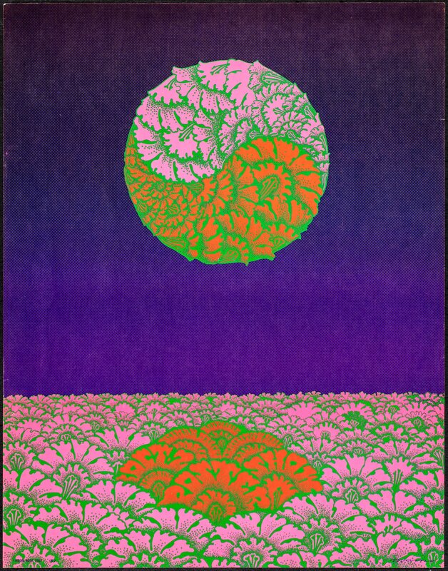
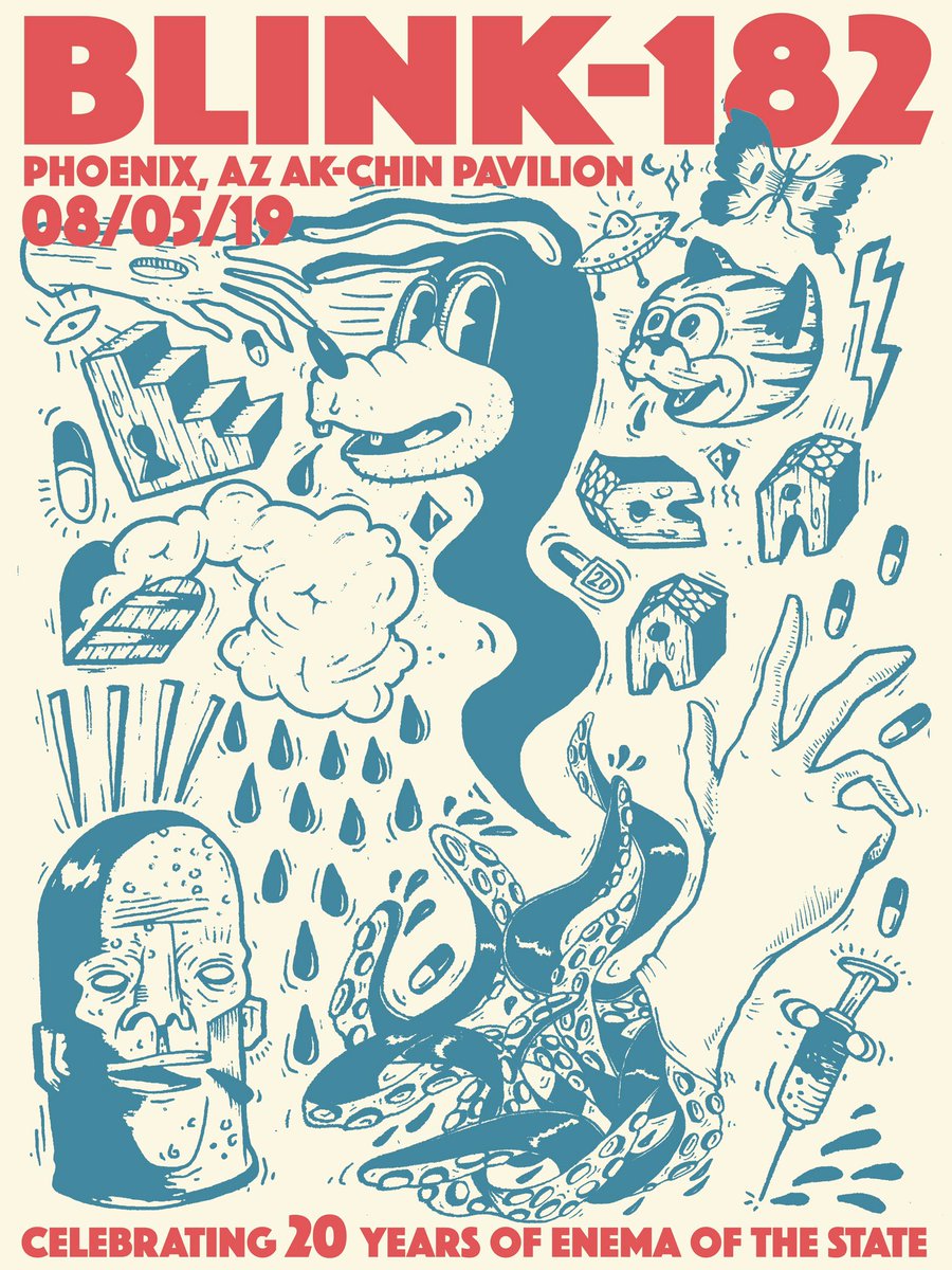
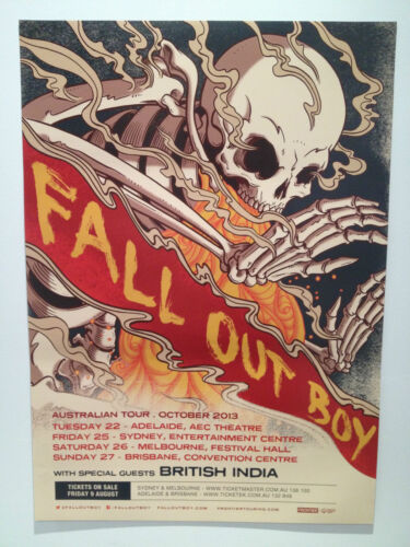
(Miscellaneous Posters from bands I was influenced by as a kid)
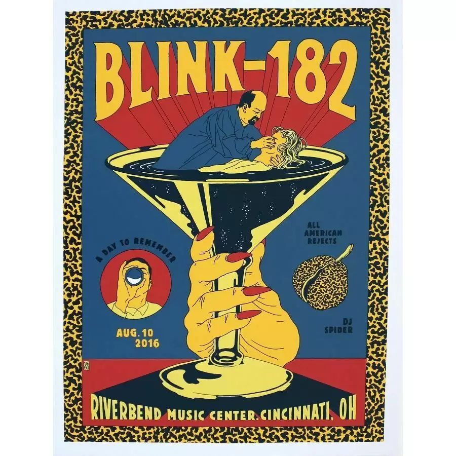

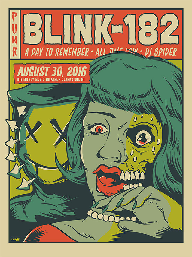
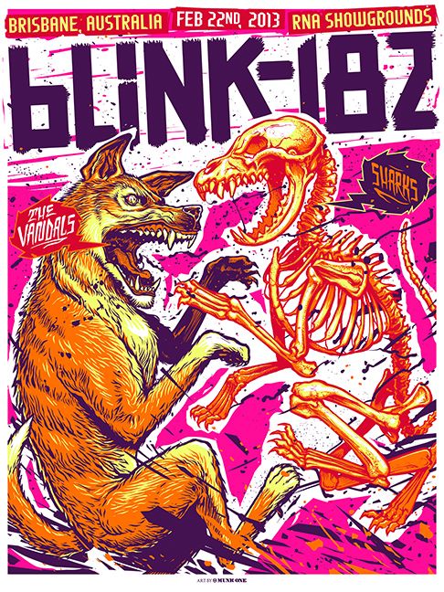
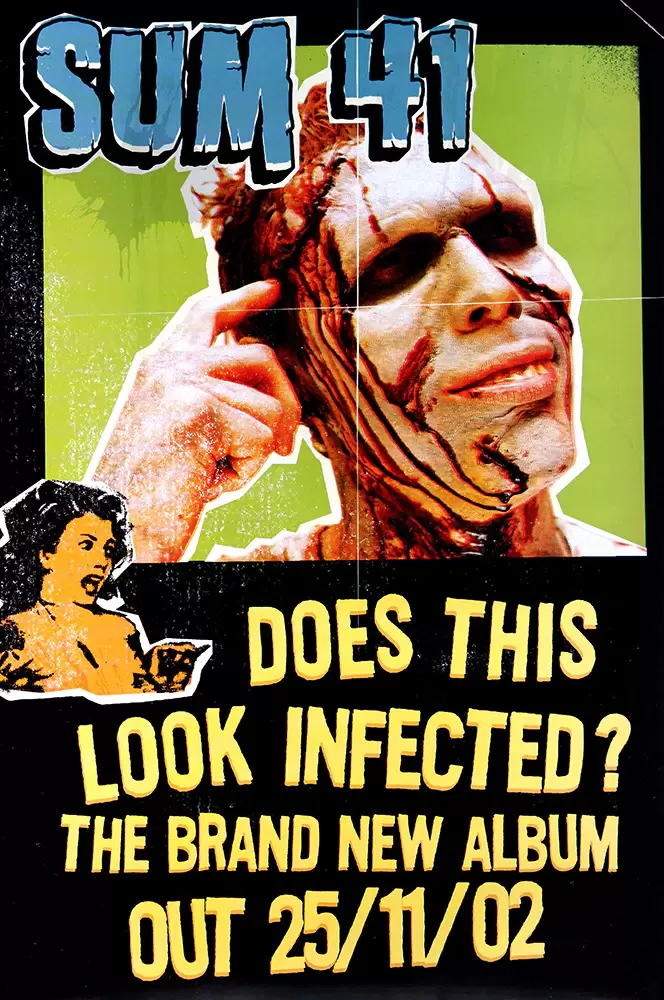
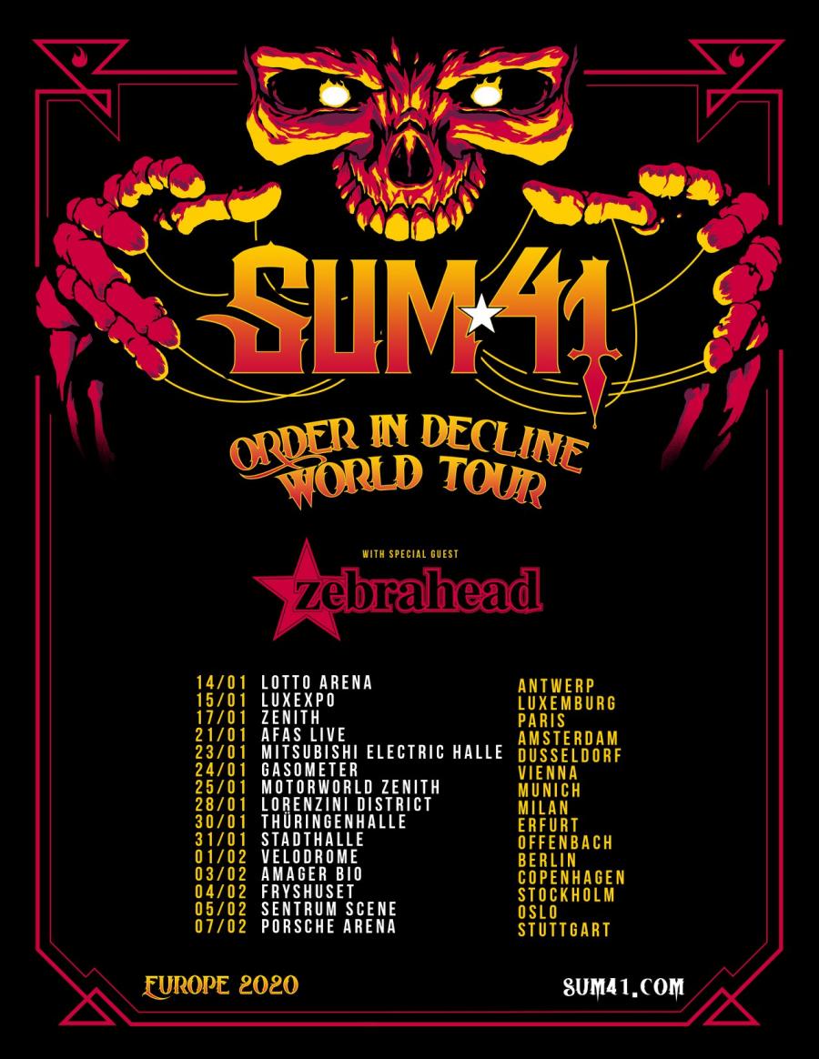
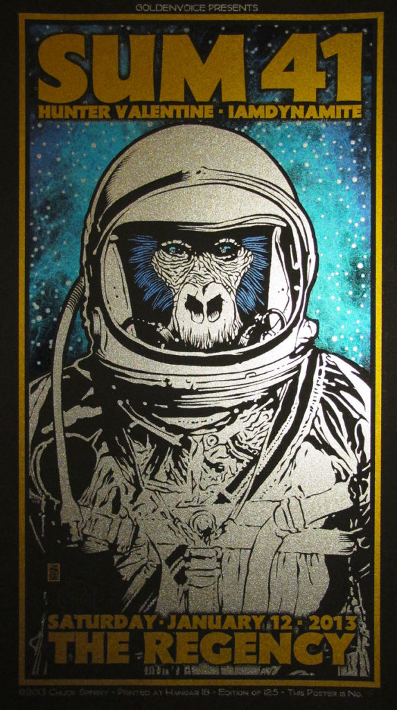
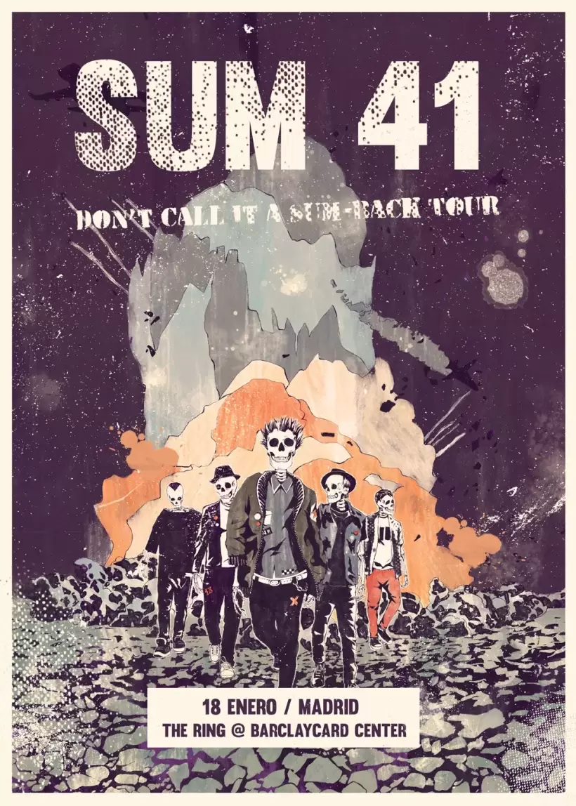
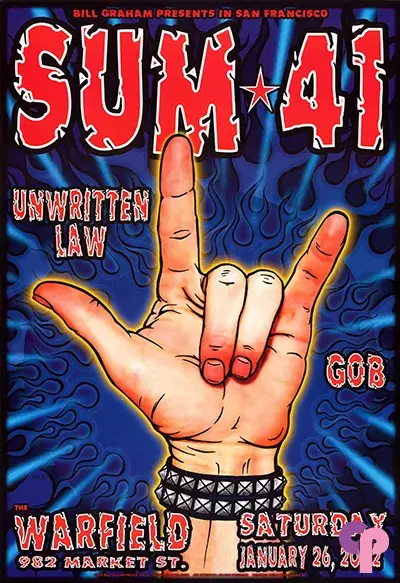
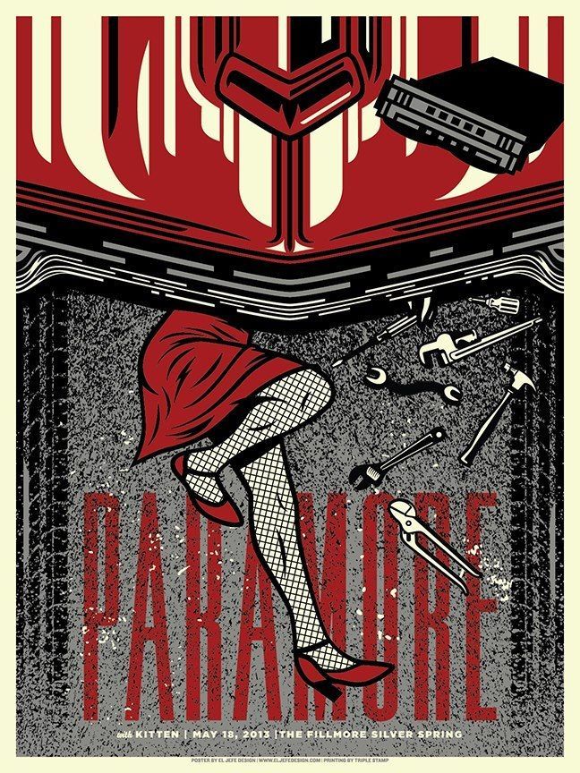
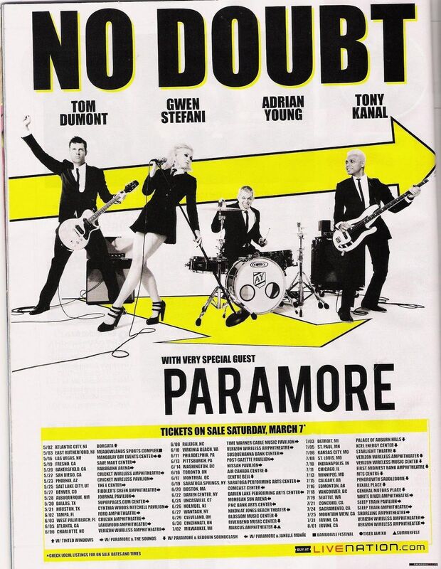
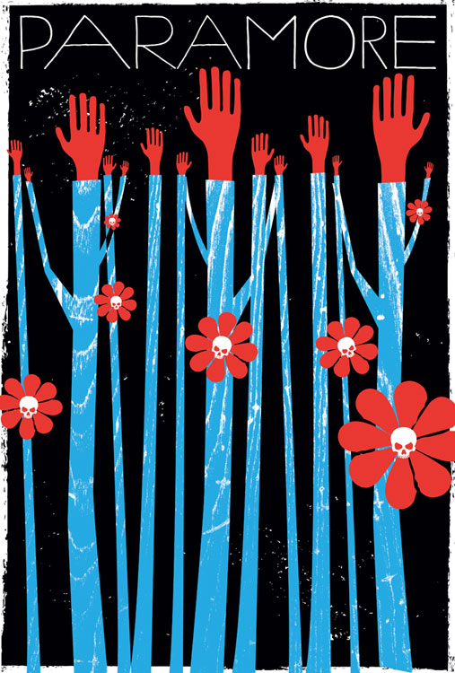
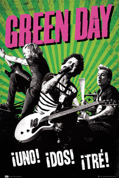
|
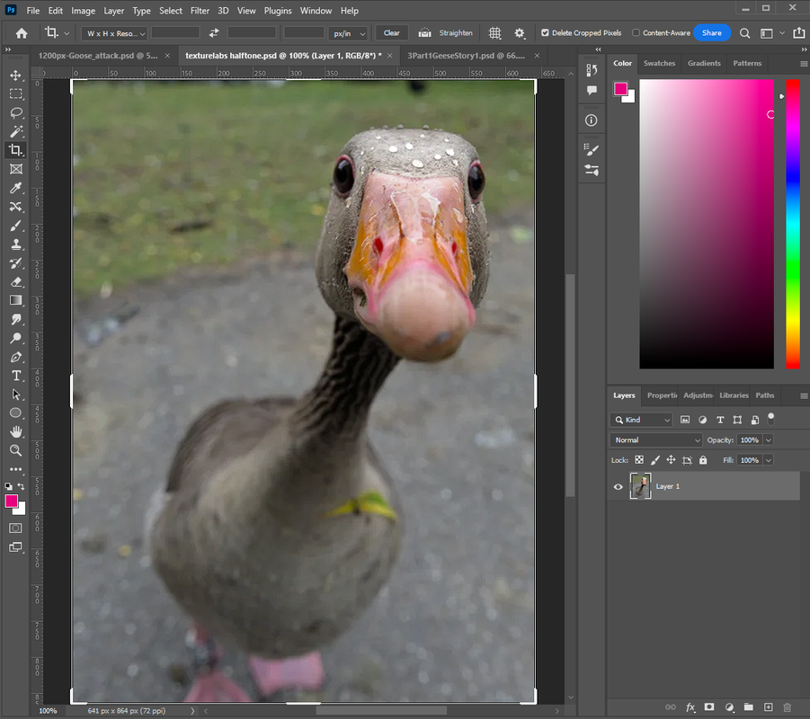
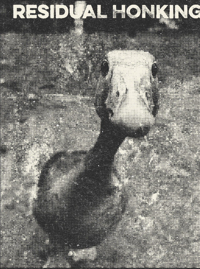
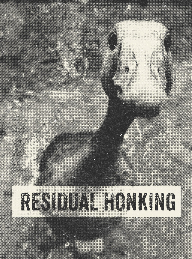
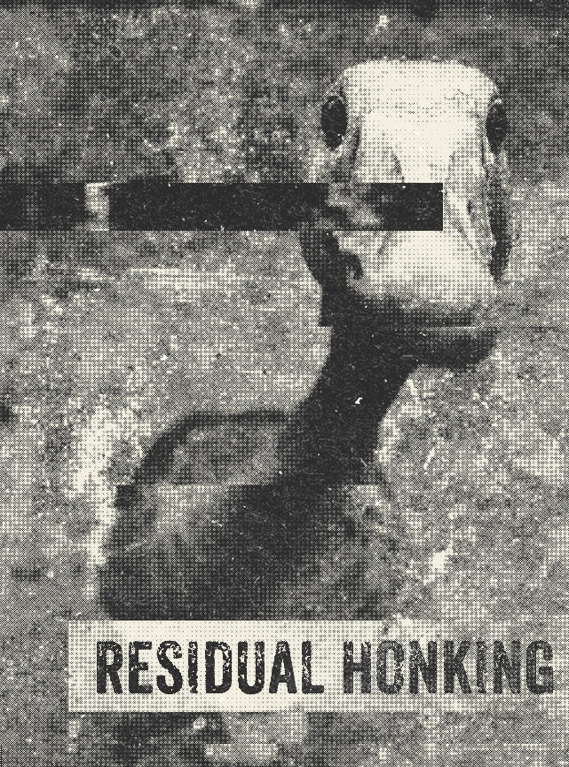
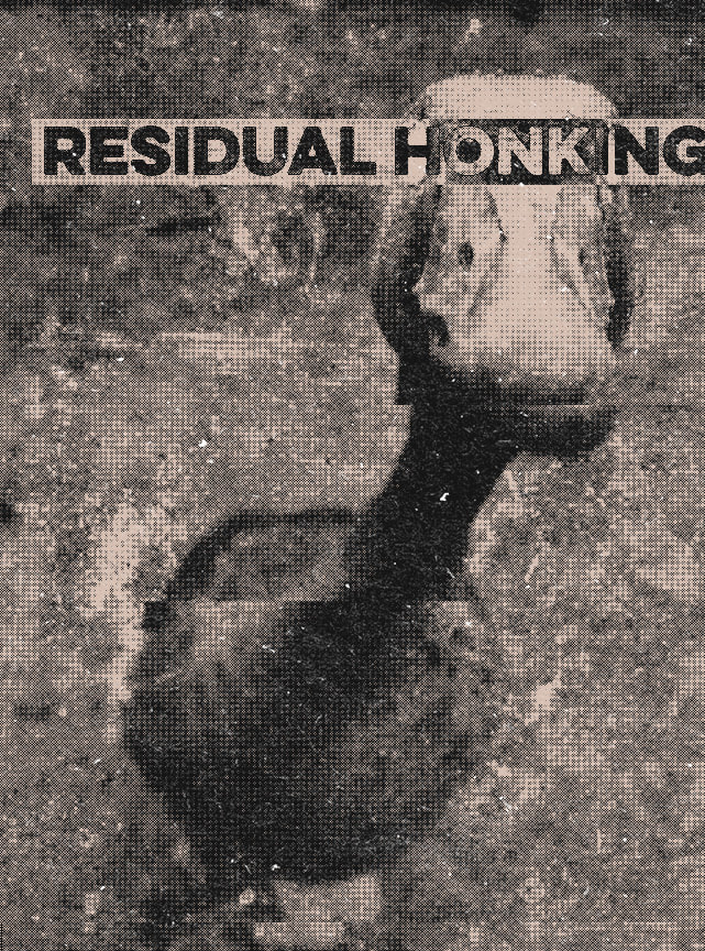
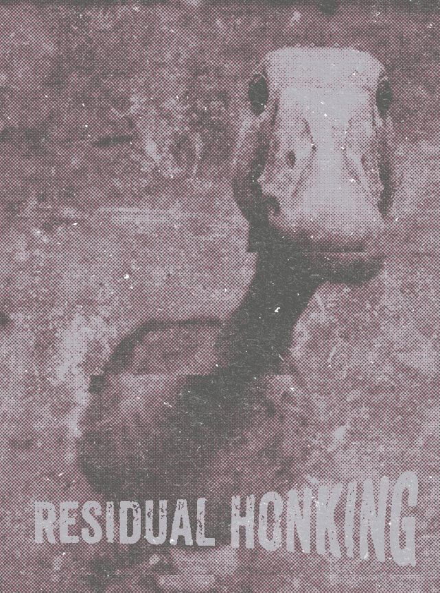
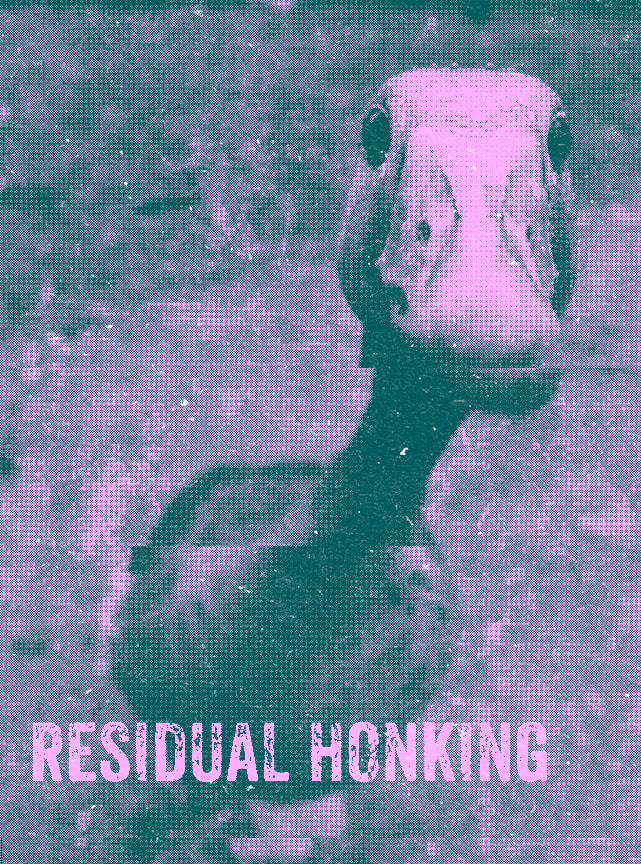
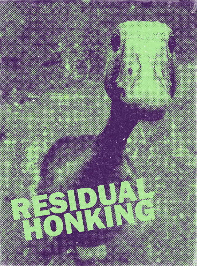
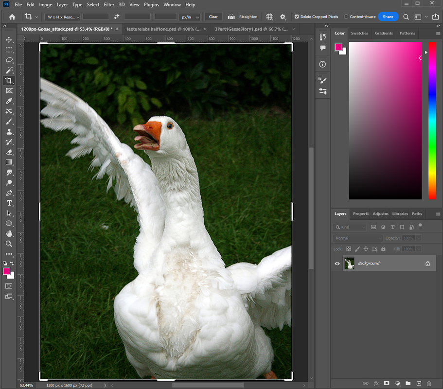
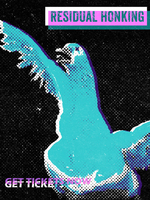
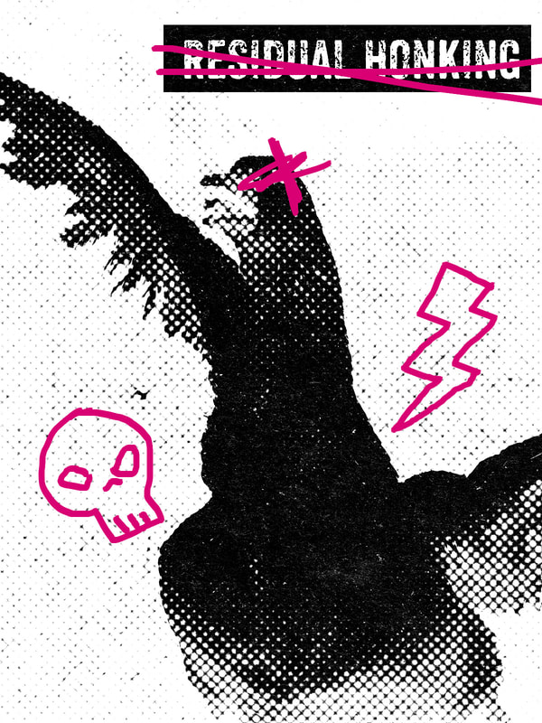
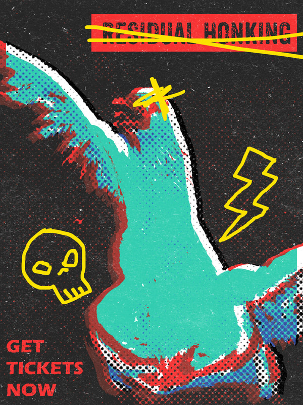
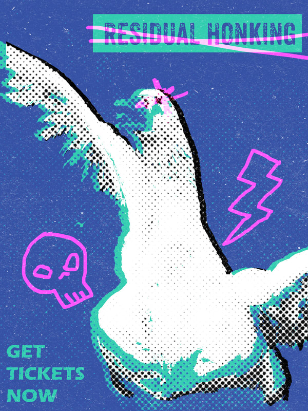
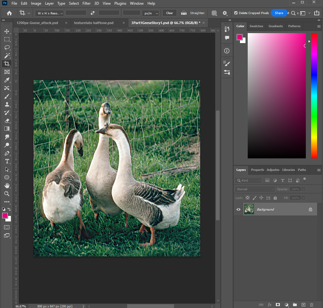
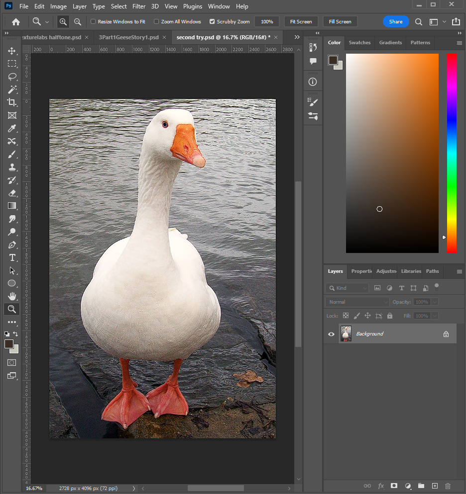
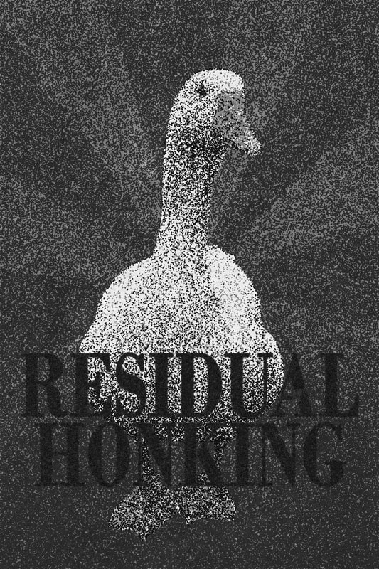
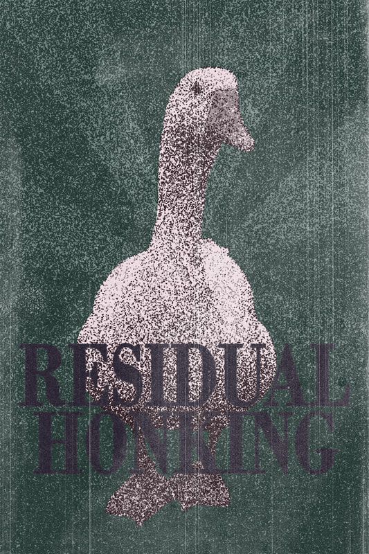
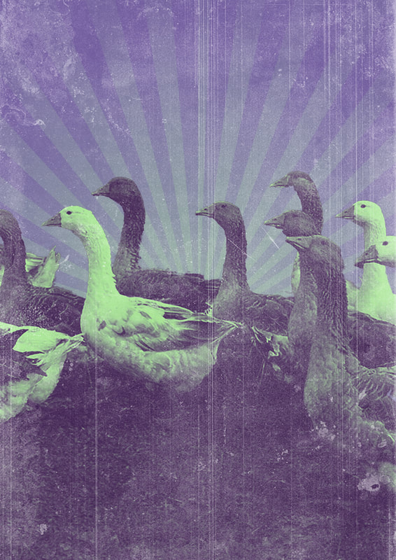
Following the tutorial above from Texturelabs, I started experimenting with an image of a goose for my gig poster and how I could utilise the halftone effect to create a grunge-y, analogue-looking image digitally. |
|
|
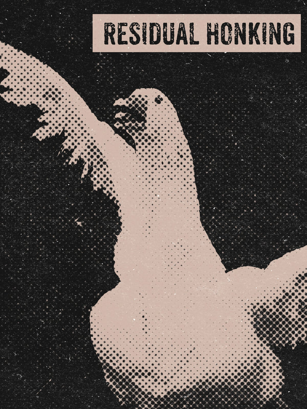
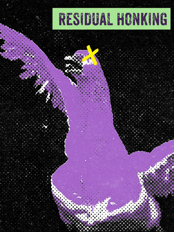
The halftone effect (all of the layers: desaturation, grunge texture, halftone dots, gradient map and paper screen texture) can be grouped and then easily dragged to a new Photoshop document to be applied to a new poster. |
|
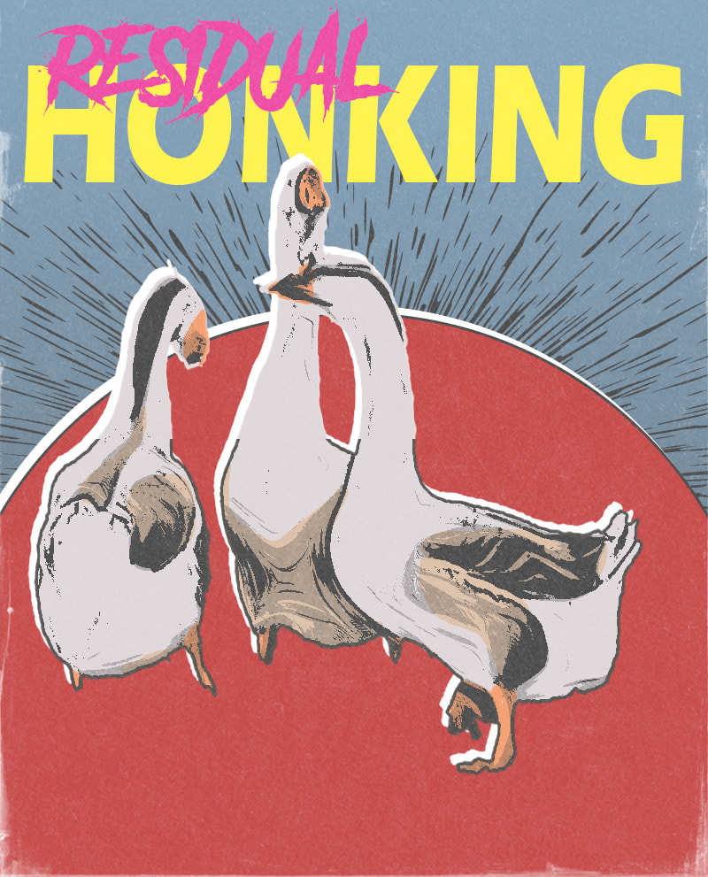
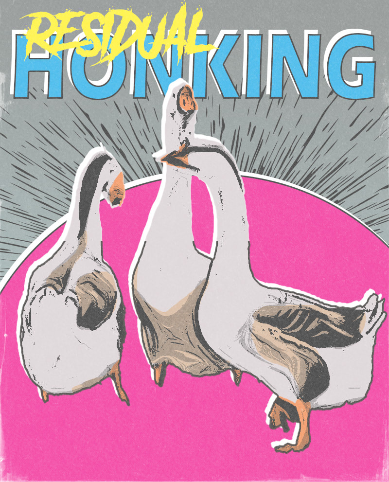
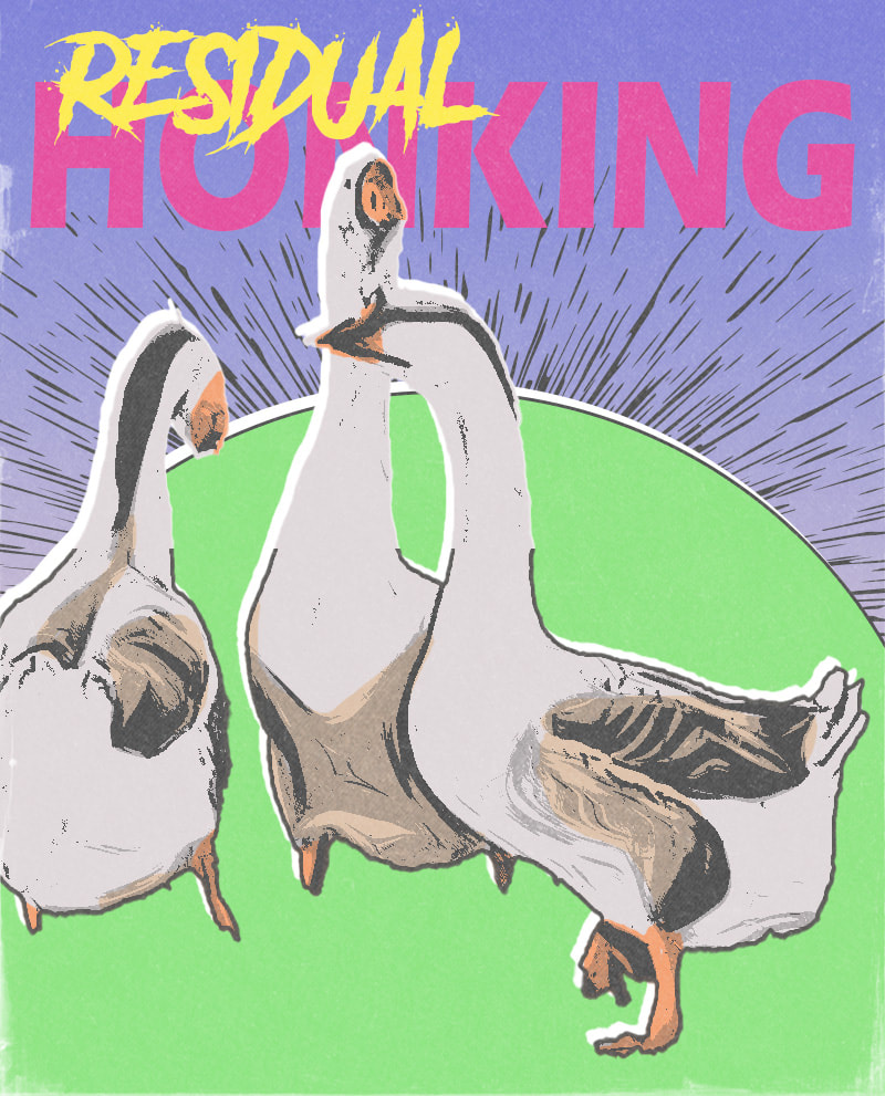
Following the above tutorial from Texturelabs, I experimented with creating a flat colour, comic book style from a photograph.
|
|
|
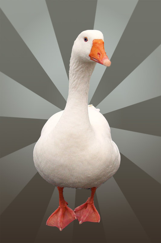
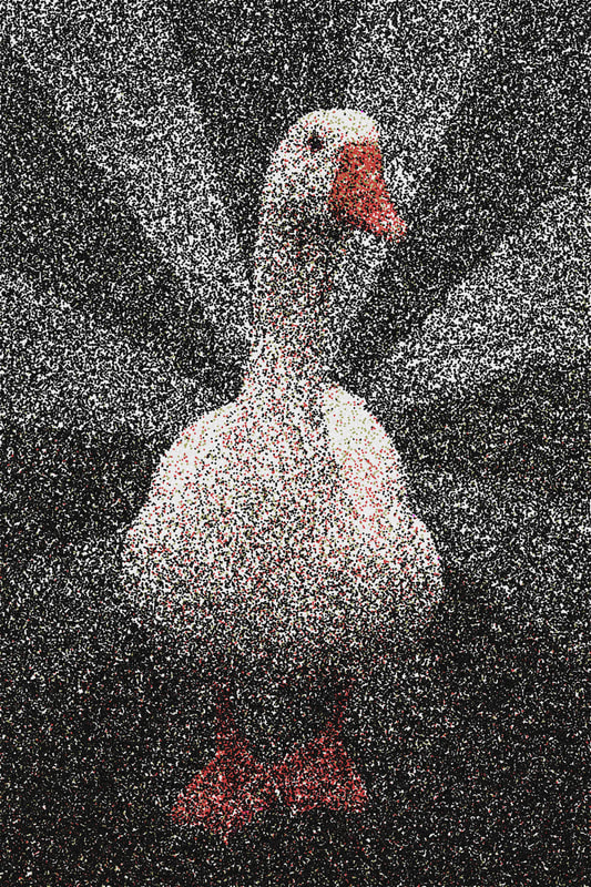
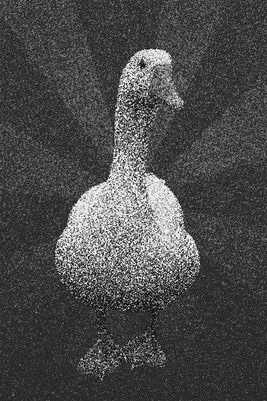
I experimented with trying to create a stipple effect because this can create a very traditional, hand-drawn look to a digital piece. I found this effect ridiculously hard to create because so many adjustments needed to be made but I discovered the two most important factors were:
- Size of canvas/image impacts clarity of image in stipple (a canvas that is too small makes the dots much too big and harder to read the image) - Using the levels adjustment to make a more extreme contrast between areas of dark and light in the base image creates a clearer image too |
|

|
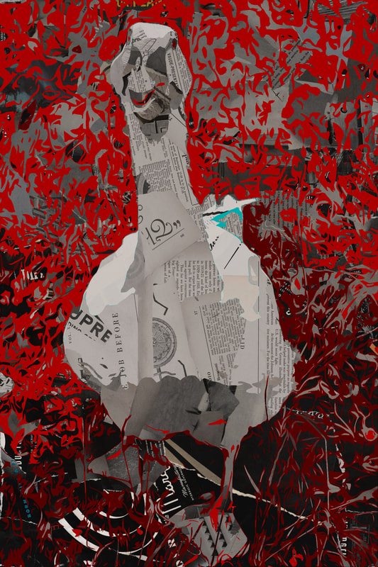
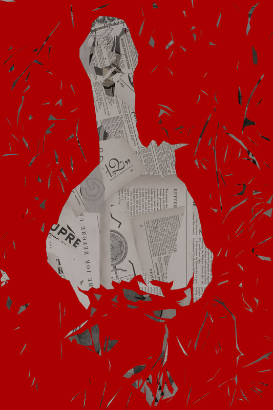
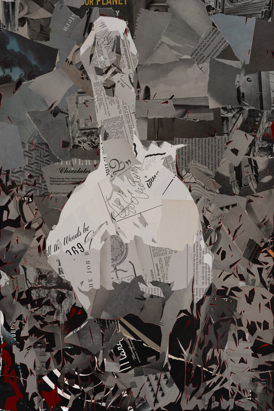
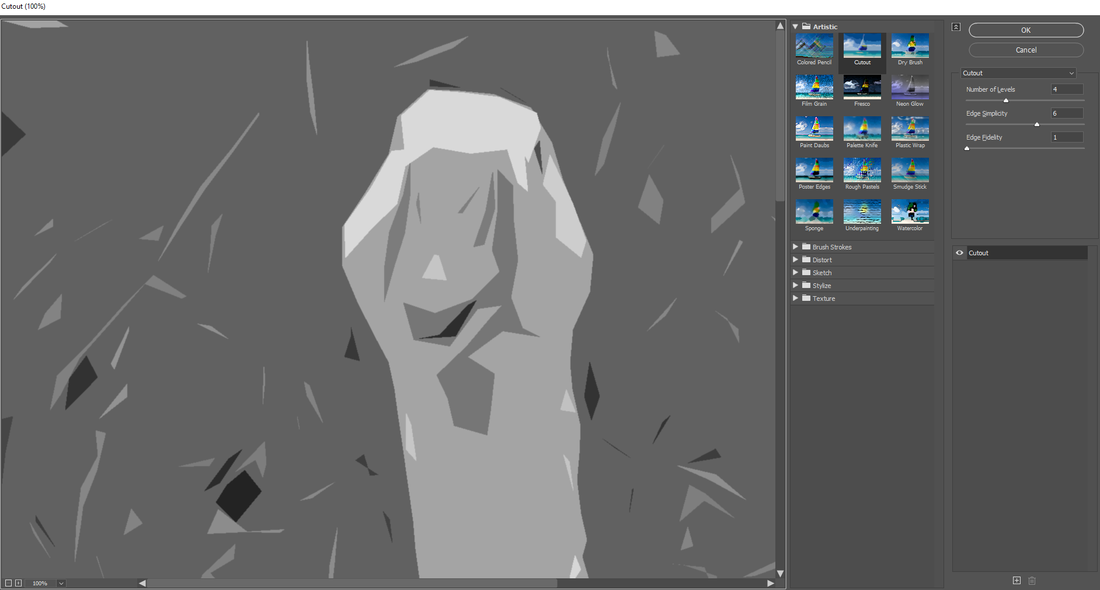
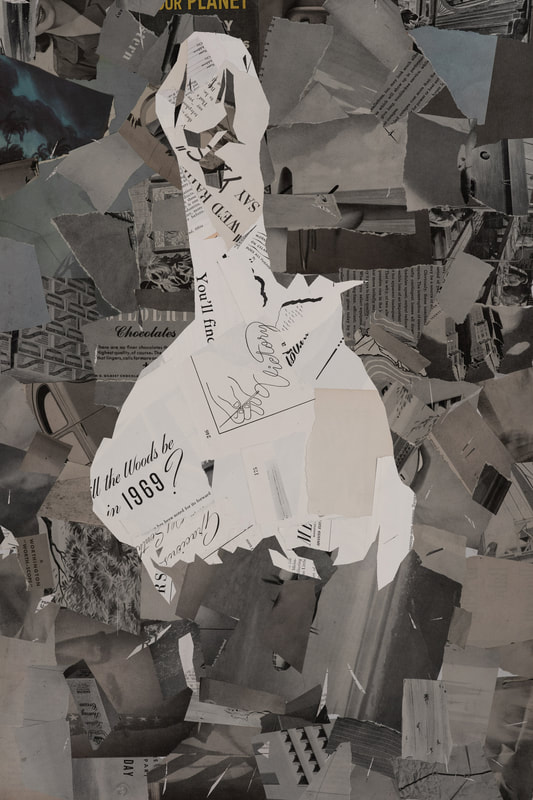
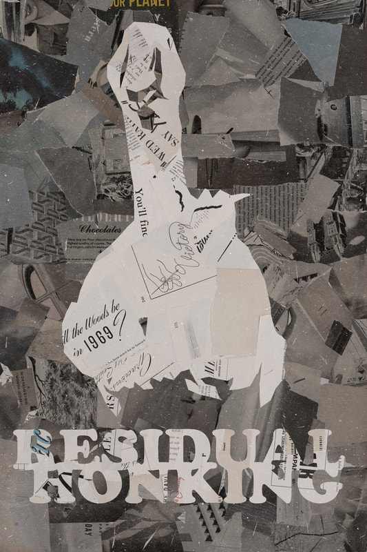
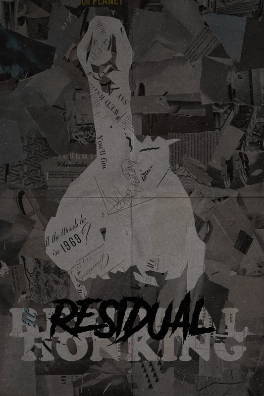
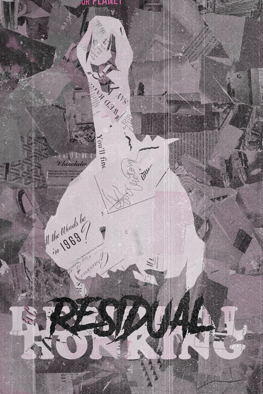
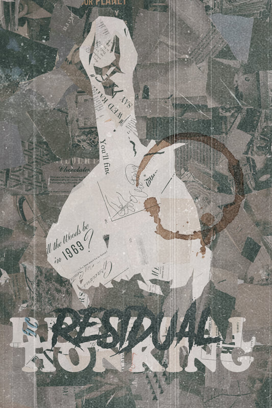
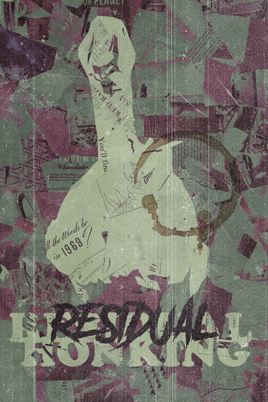
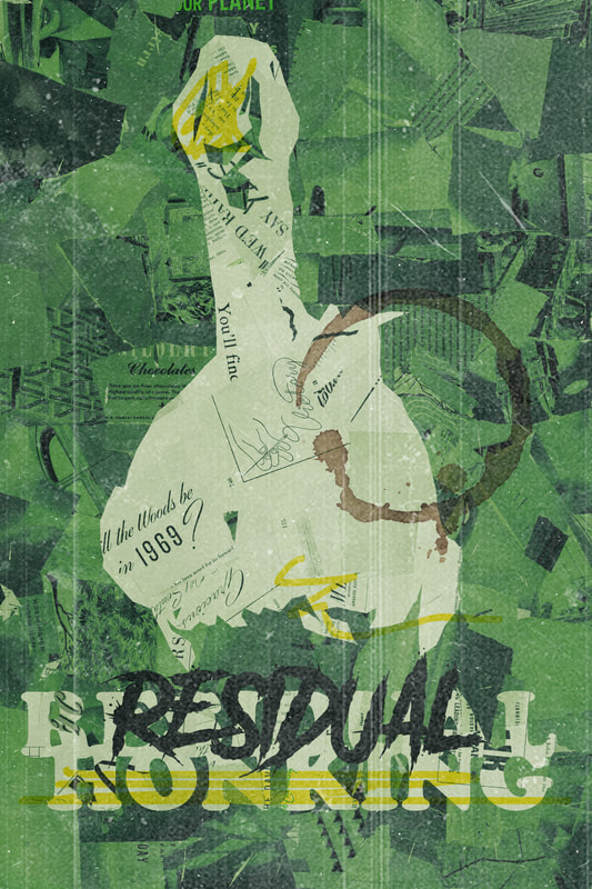
Experimenting with creating a collage effect completely digitally. This was an easy and effective method that worked well right up until the end, I was left with a fifth tone that turned a burgundy red colour and could not work out how it appeared as I made sure to only have 4 levels of tone. I think it is because my image was too complex. I messed around in every filter to adjust it and found the only thing that removed the burgundy was to reduce it to 2 levels - but this lost a lot of detail and made it less impactful.
|
|
|
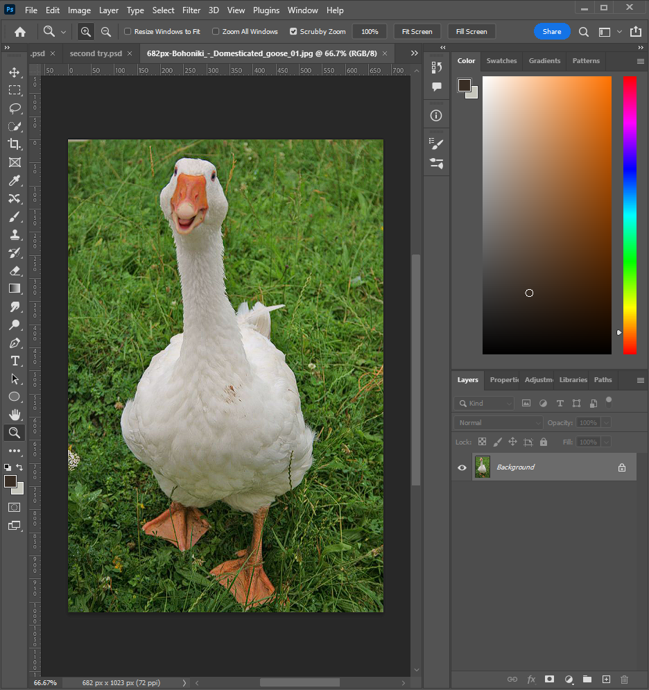
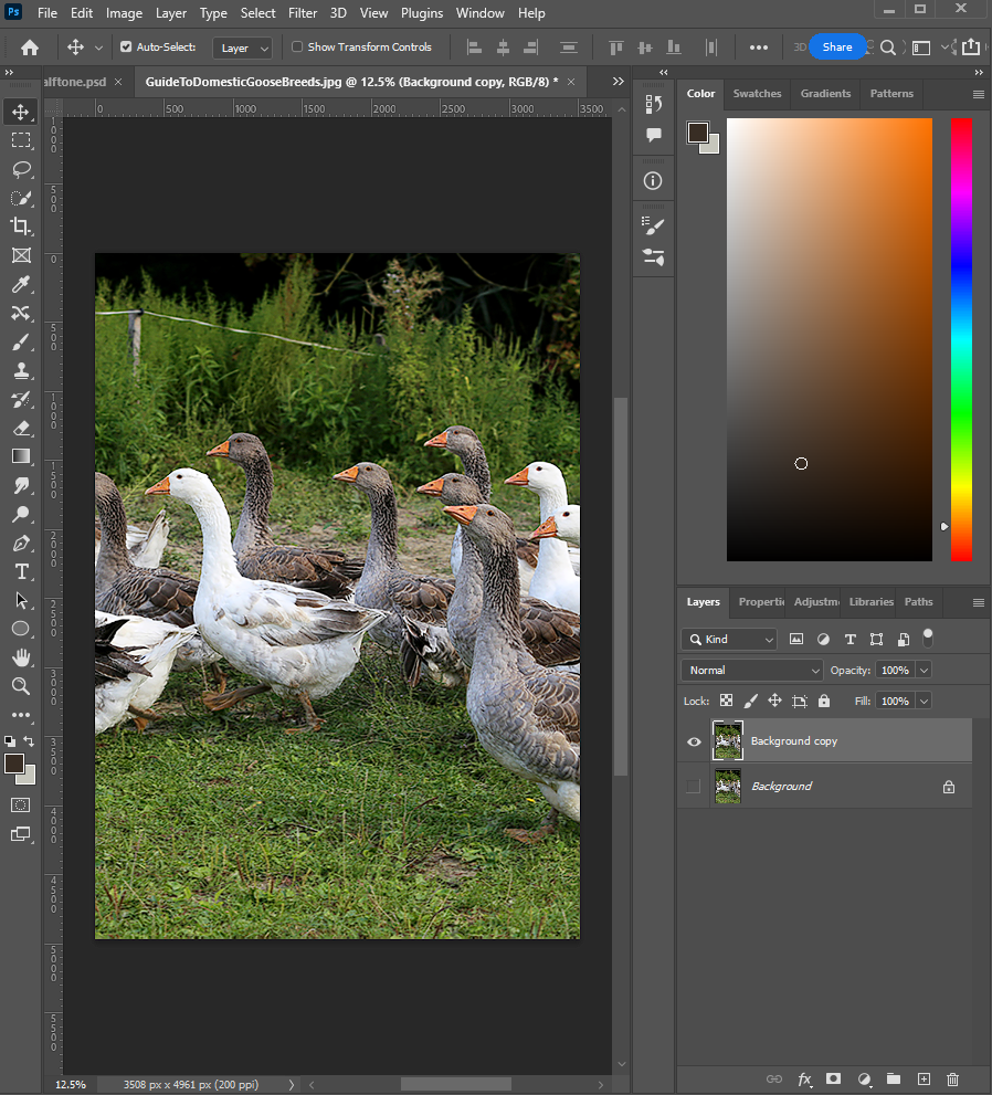
For this poster, I needed to go back to basics to remove the background of the image. Up until now, I had been relying on the "remove background" button but this image was too complex for this to work effectively. I then realised I couldn't remember an easy way to go about removing the background of an image which was an embarrassing moment but I followed this tutorial and remembered that there are multiple ways to do a single thing in Photoshop and practice determines which method ends up being quickest and easiest.
|
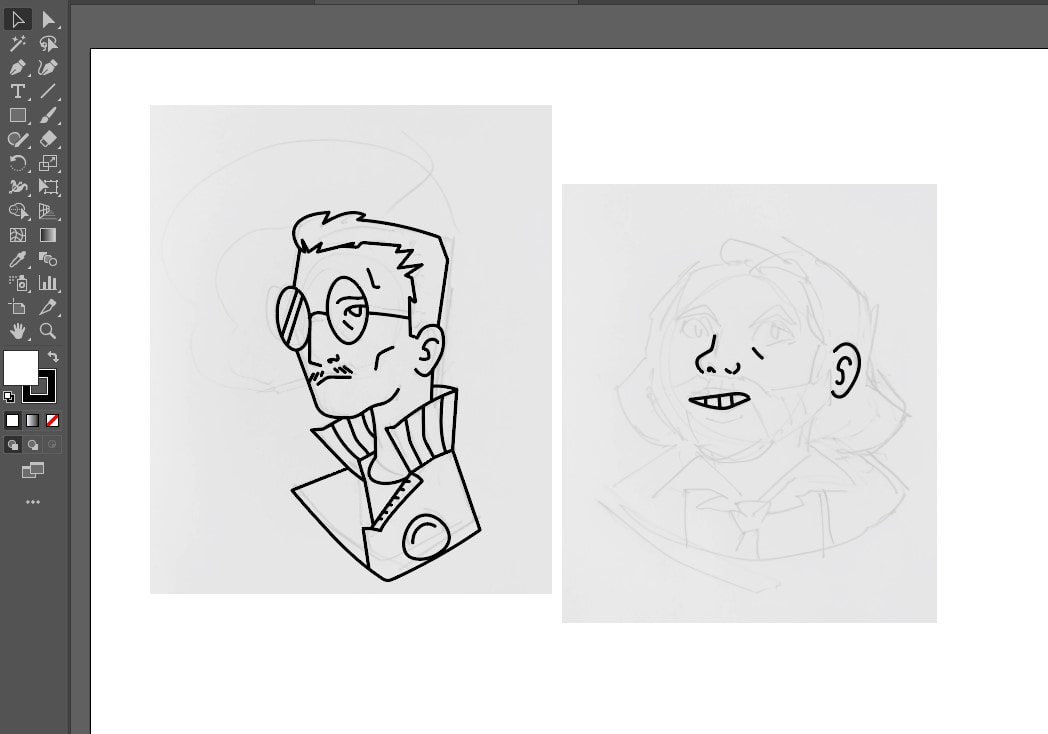
WEEK 7-8: Illustrator
As photoshop works with Bitmap images, illustrator works with vector. Whilst bitmap is good for tone, texture, natural gradients and other 'photographic' qualities, it is not good for enlarging images (to enlarge a bitmap image, you are asking the programme to create new content in order to fill in the gaps. The more you increase, the more new or false visual information is generated, leading to a degradation of image quality). Illustrator, on the other hand, is less capable at creating complex, natural photographic qualities but does benefit from the ability to rescale infinitely without any alteration to definition and over all quality.
Vector images are stored as a series coordinates that define a line between points. Increasing (or decreasing) scale, does not alter the relativity of these points, meaning that images remain unaltered.
Vector images are stored as a series coordinates that define a line between points. Increasing (or decreasing) scale, does not alter the relativity of these points, meaning that images remain unaltered.
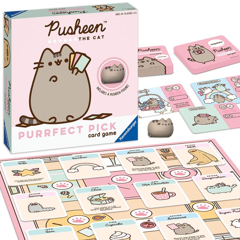
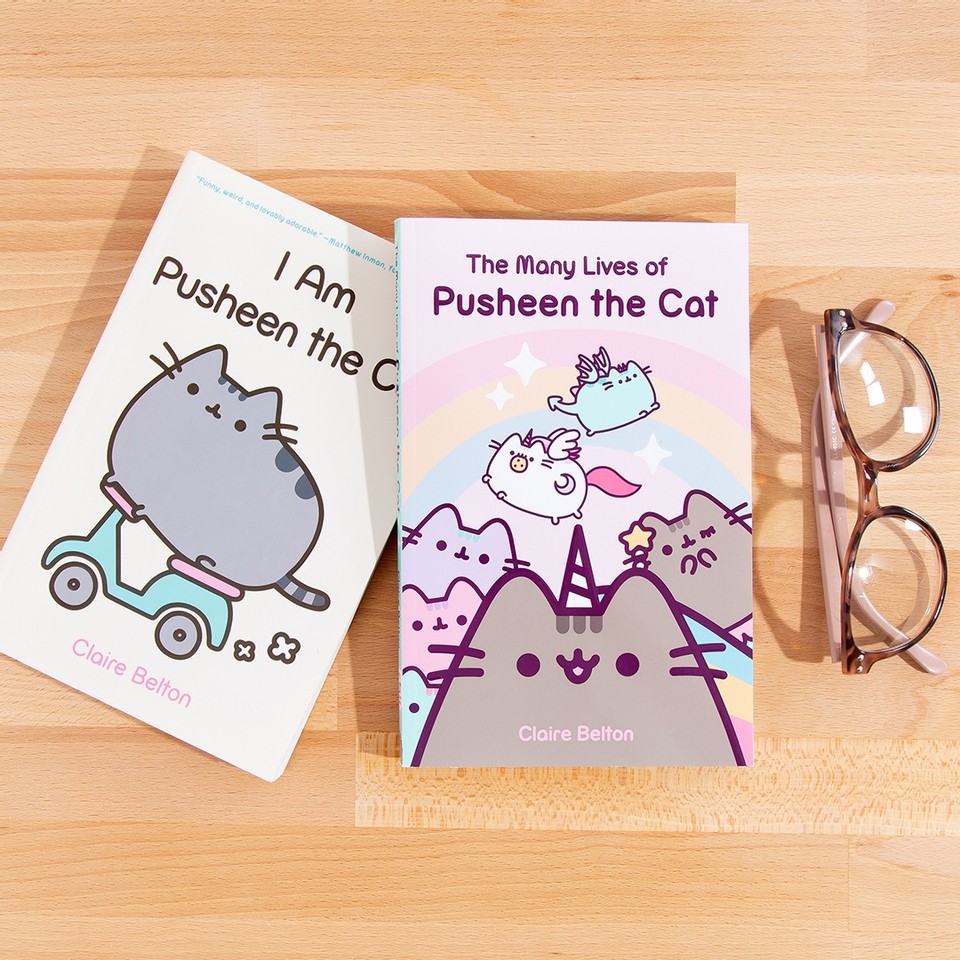
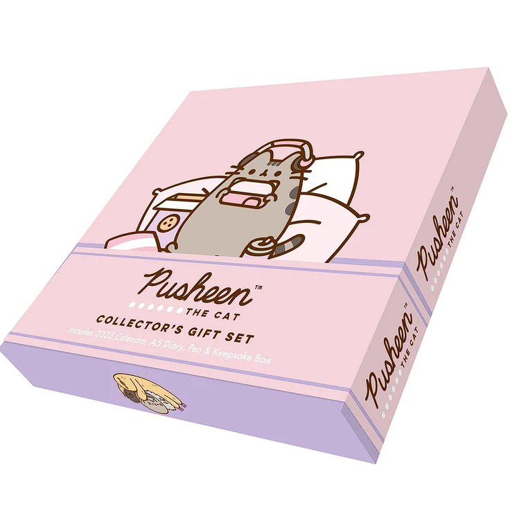
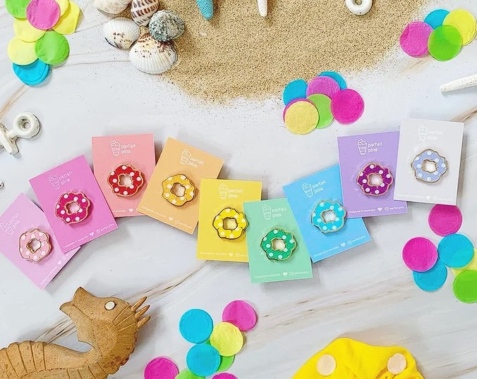
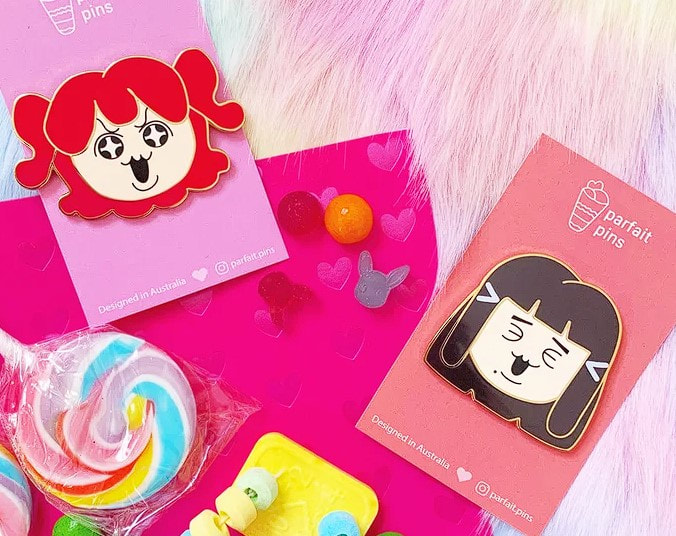
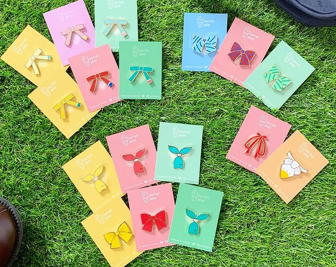
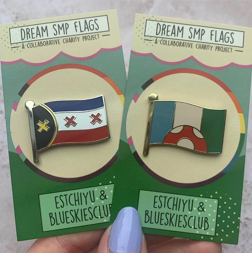
Pusheen (Brand)

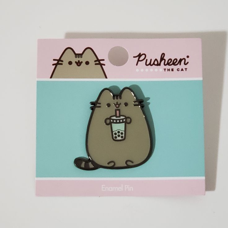
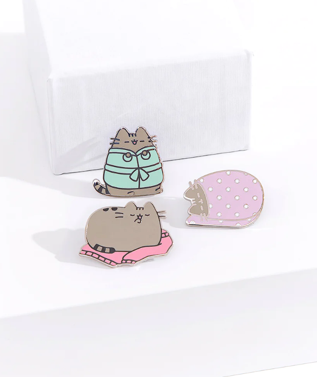
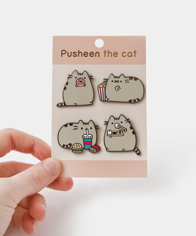
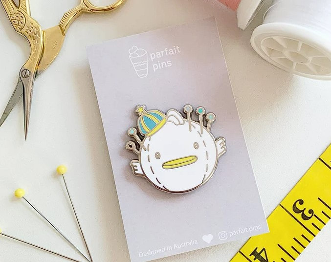
Miscellaneous Designs
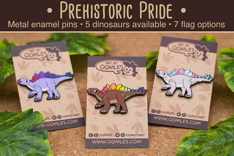
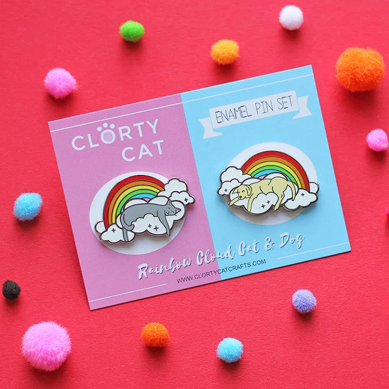
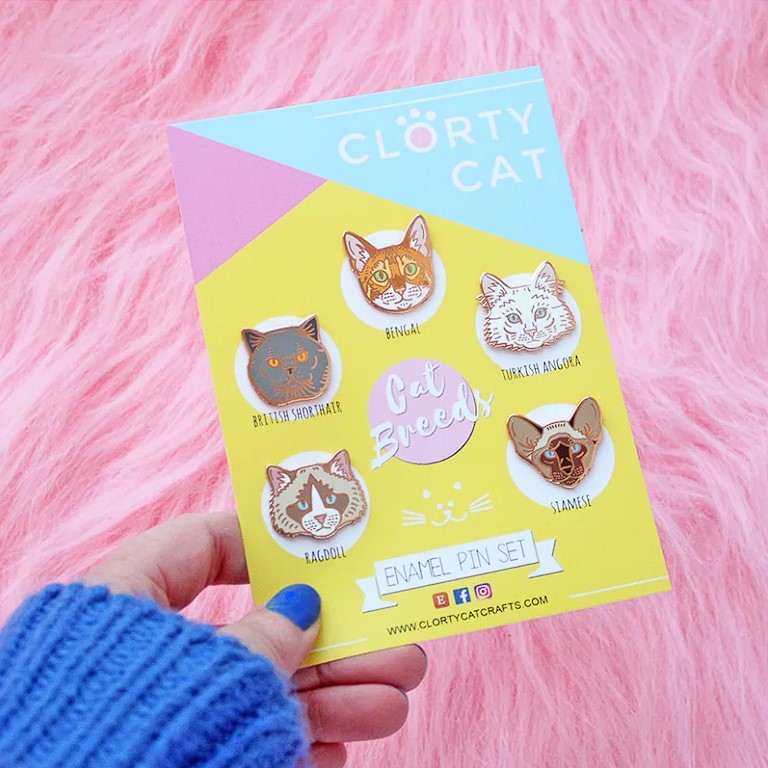
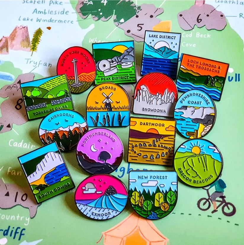
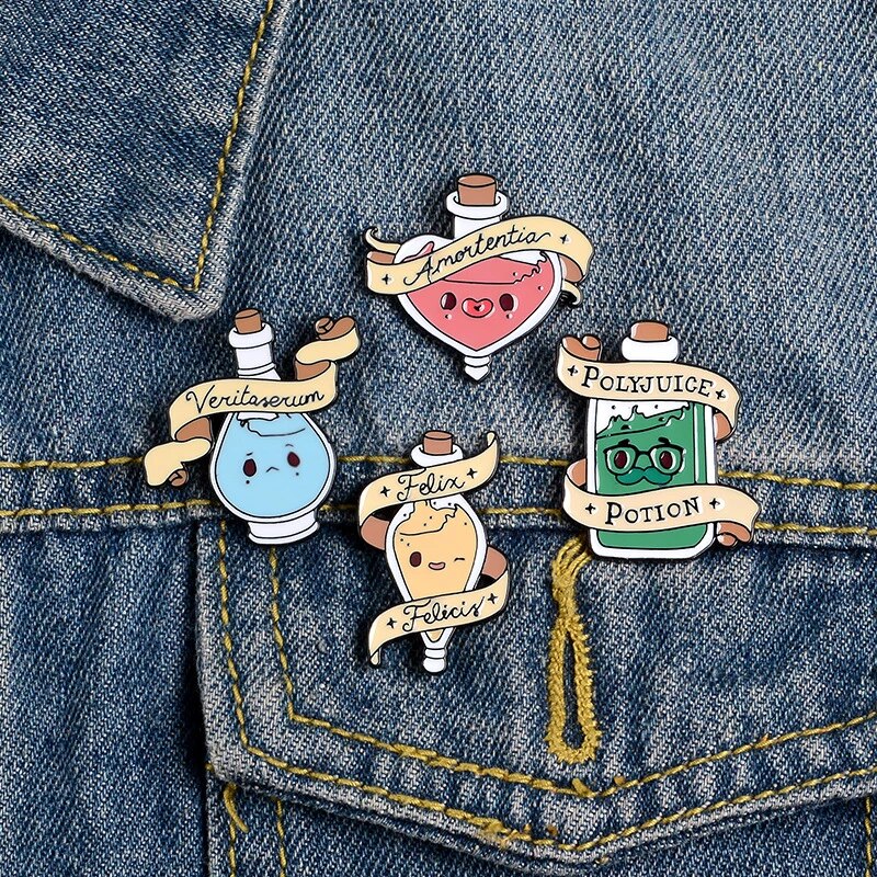
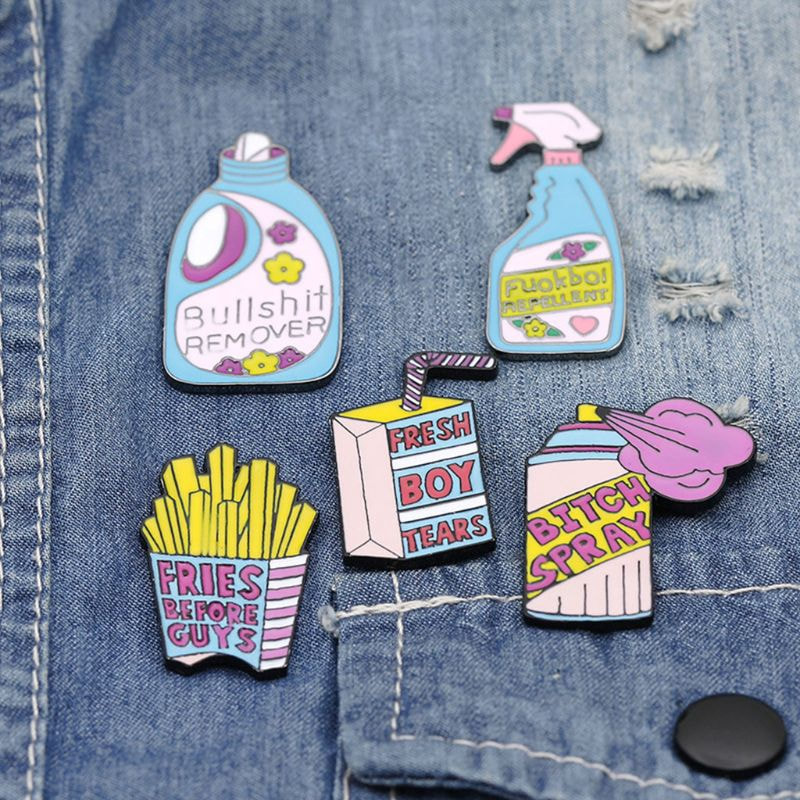
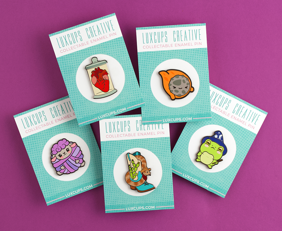
|
|
|
Mob Pin-sycho 100
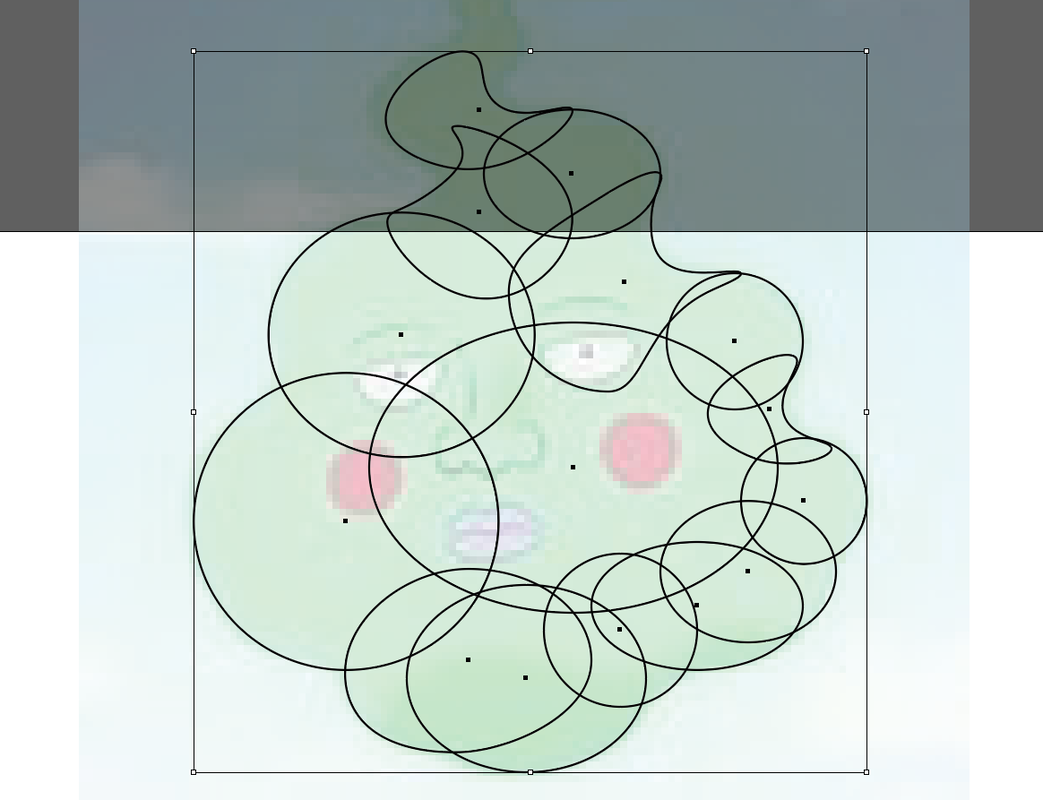 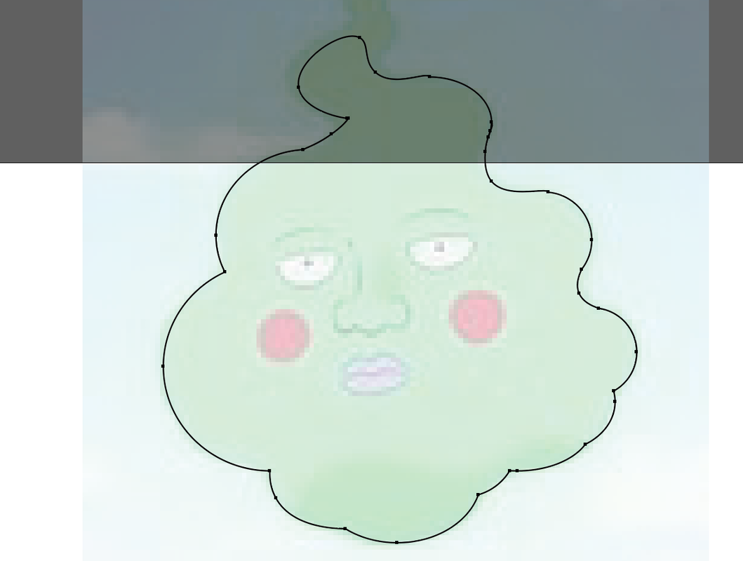 |
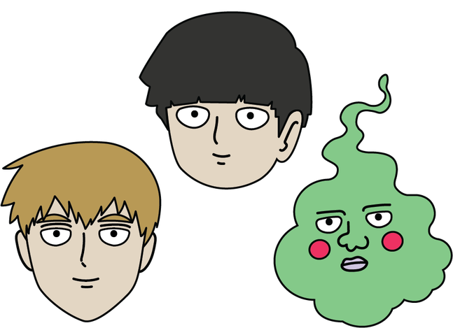
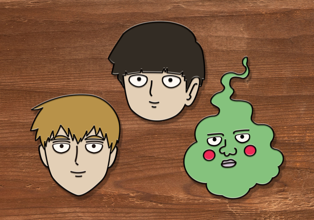
To start with, I traced around images of Mob Psycho 100 characters to try the pen tool in Adobe Illustrator. I found that using the Shape Builder tool to stitch together separate circles was more effective at creating the lines I wanted rather than tracing.
|
Studio Pinners
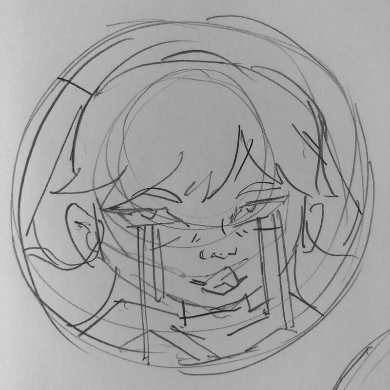 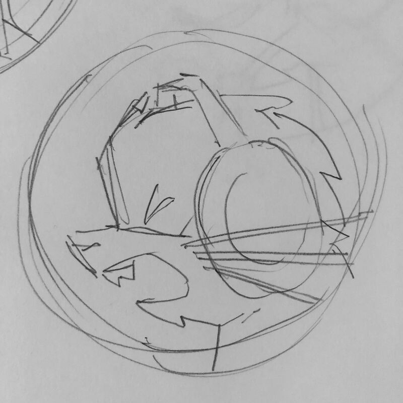 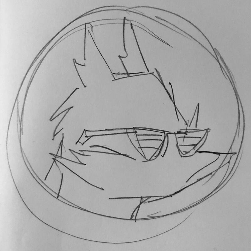 |
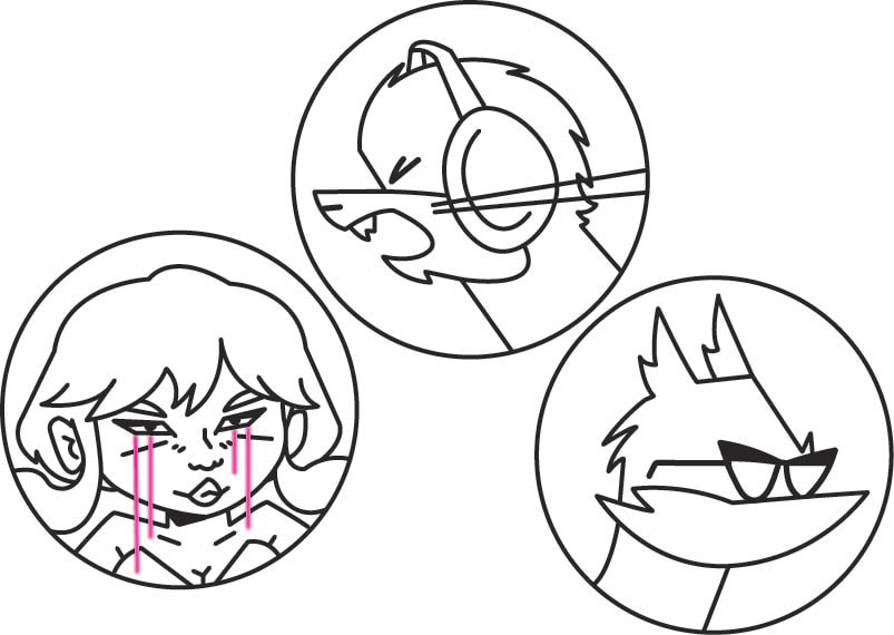
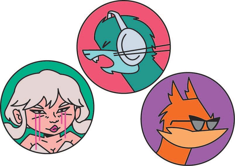
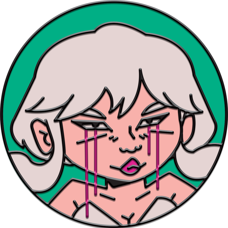
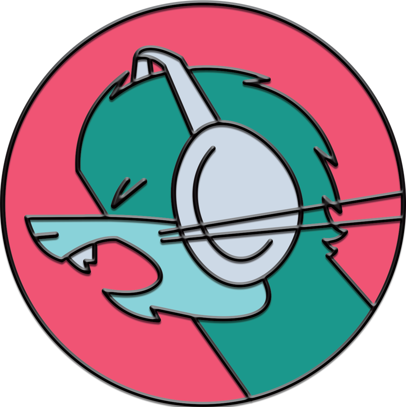
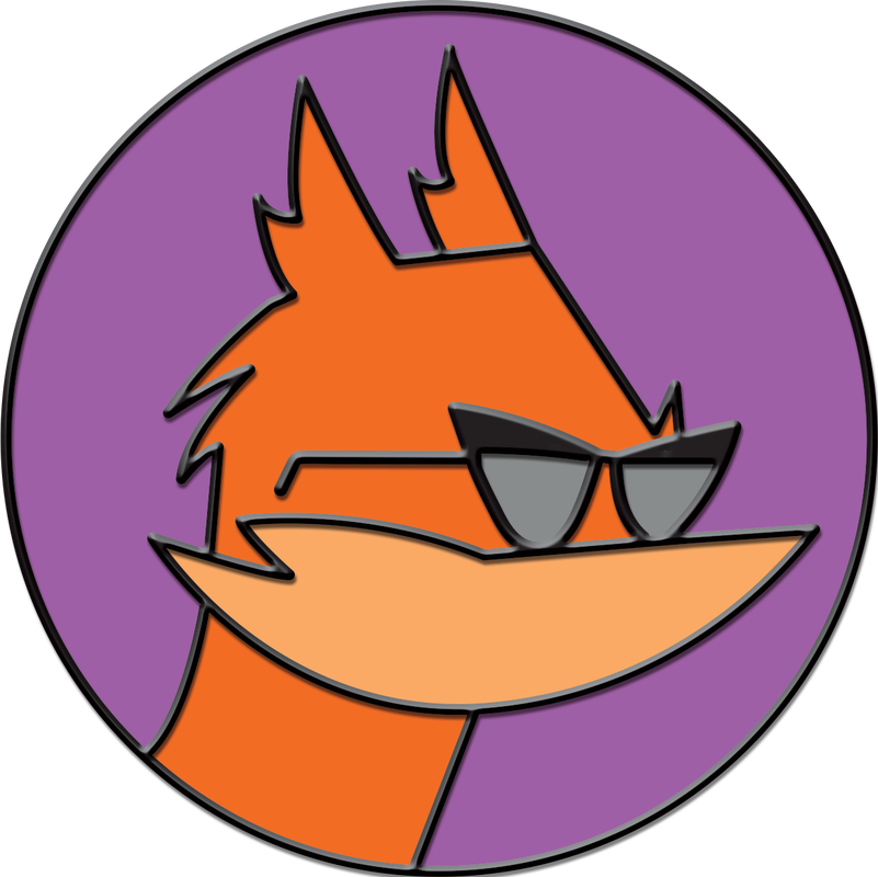
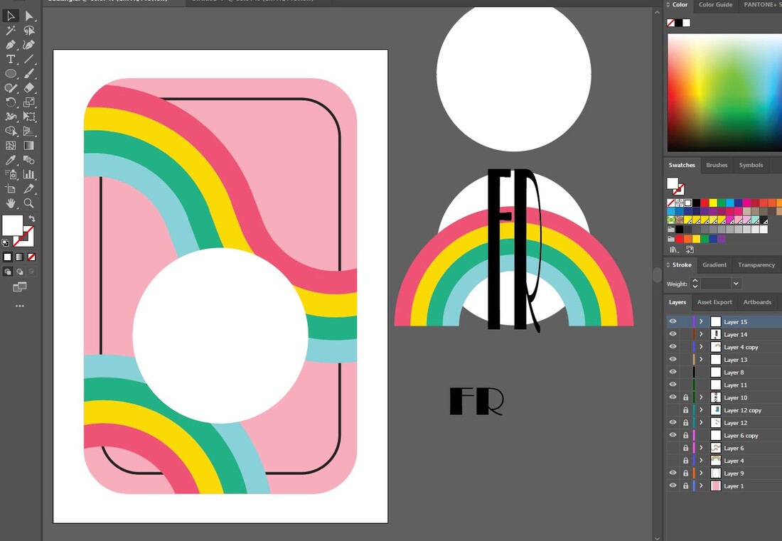
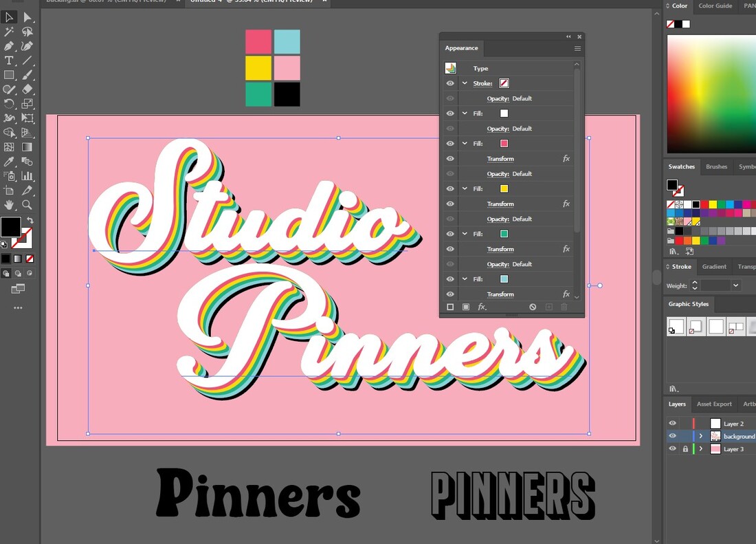
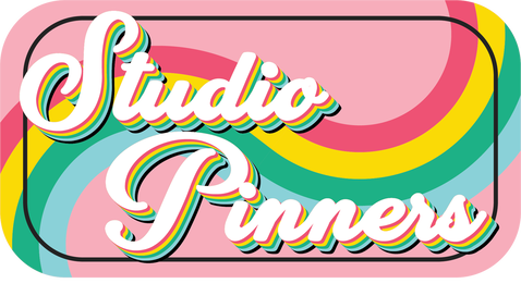
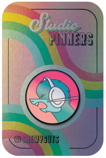
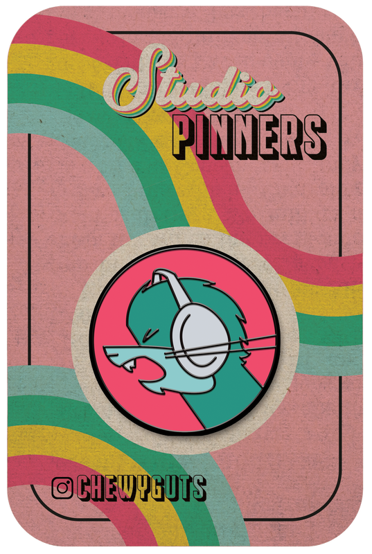
For my next set of pins, I wanted to create some designs that had more of my own voice in them - rather than copying directly from an image. I was inspired to use the characters from Studio Killers for this set, as I usually draw and brainstorm while listening to their music and I am incredibly inspired by their art style, character designs and music videos.
|
|
|
|
|
|
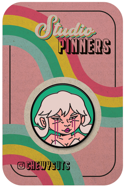
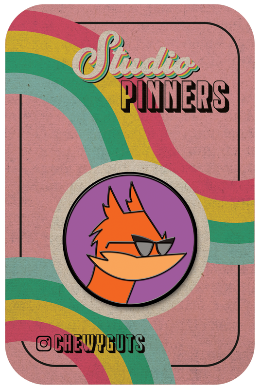
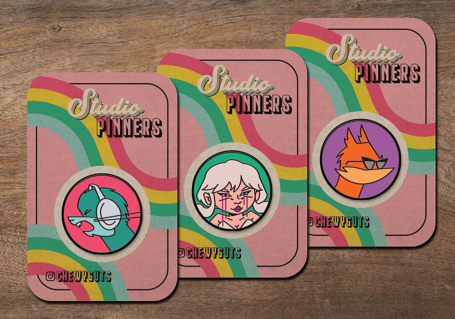
Disco Pin-lysium
|
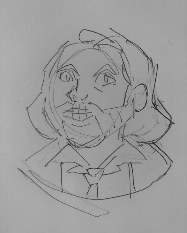
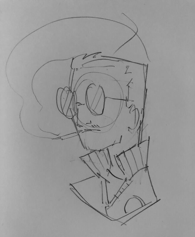
I wasn't satisfied with my Studio Pinners set, I felt that because I had put them all on a circular background they were less visually interesting, and still too similar to the style of the original source material. I wanted to try again and experiment further with Illustrator. I've been playing Disco Elysium recently and have been very inspired by the characters and art style, so I wanted to try making pins of them. I felt this would be a bigger challenge than the previous two pin sets as the Disco Elysium style is very abstract and painterly, rather than having bold simple lines that easily translate to vectors in Illustrator.
|
  |