BRIEF
I will make a 3-5 minute animation in the style of a stand-alone “pilot” episode for an ongoing animated show for Cartoon Network.
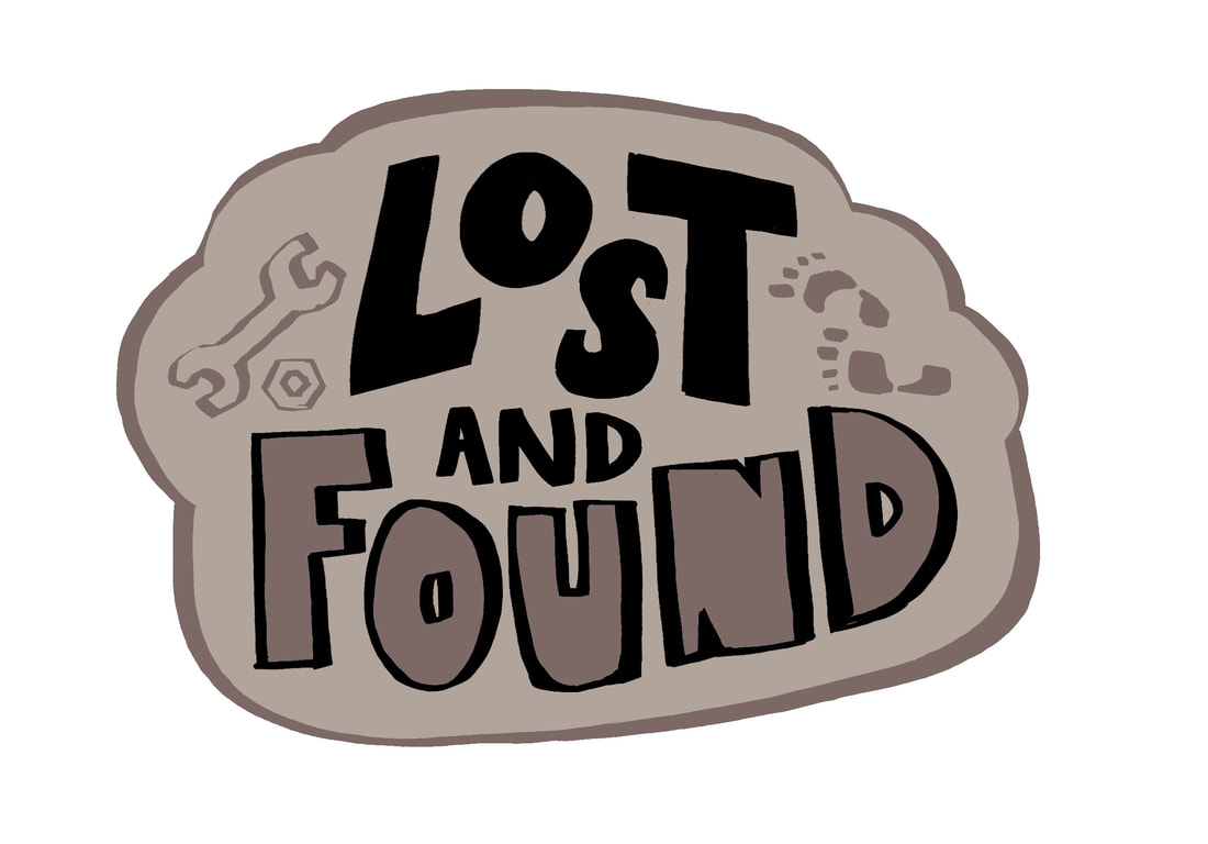
The title is taken from an original story I have been working on called "Lost and Found".
The title is taken from an original story I have been working on called "Lost and Found".
INSPIRATION
STEVEN UNIVERSE
One of my biggest inspirations of all time - the reason I started drawing in the first place.


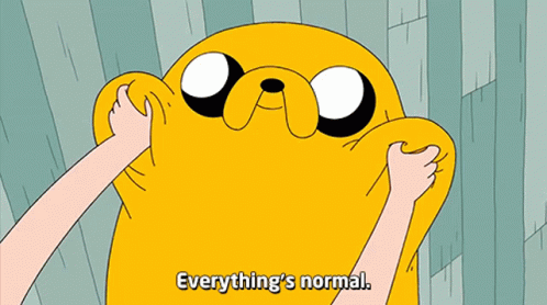
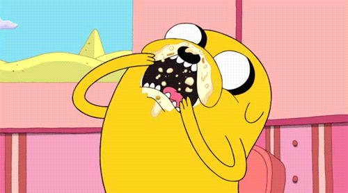
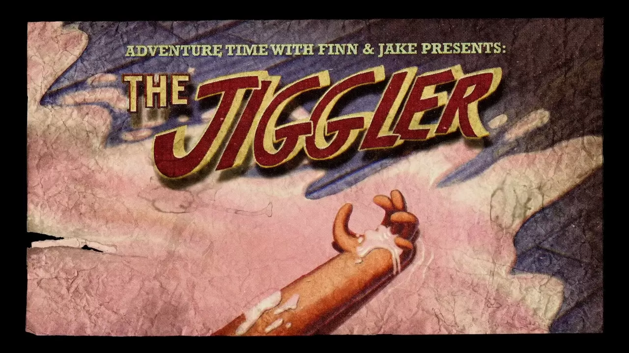
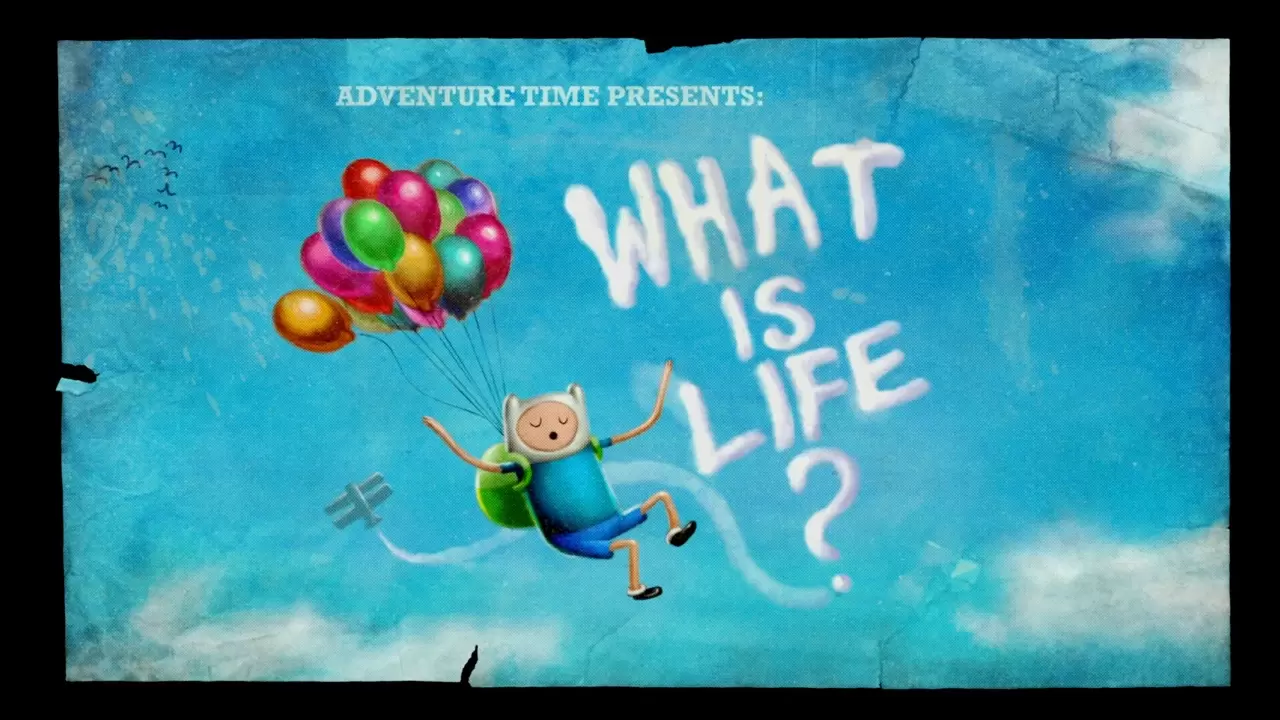
ADVENTURE TIME
The style of narrative and humour shaped me as a person.


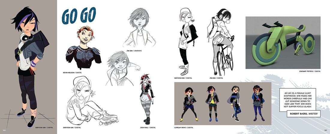
REGULAR SHOW
Tone and style.


NARRATIVE AND THEMES
Over the years, I’ve had lots of ideas for stories and concepts but the ones I always come back to revolve around robots/androids/artificial intelligence and how they interact with humanity. Using some of the original characters I’ve had floating around in my head and in my sketchbooks since I was a young teen, I want to properly develop a story and produce a stand-alone “pilot” or teaser episode for my own hypothetical Cartoon Network show.
Examples of my Existing Original Characters (from 2021-2023)


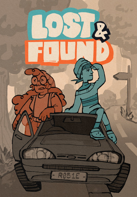
Bunnie (Blue), Maddison (Orange) and Dylan (Green) are the three characters I want to completely redesign and develop specifically for this animation.
Initial Brainstorming


I started getting inspired by the recent trend of AI becoming a bigger part of our modern society. In artistic spaces online, “AI Art” is an huge cause for debate and a pressing subject in discussion about the future of artistic careers and industry. But this scenario can - and is - unfolding in a lot of different areas of the contemporary human experience. One thing in particular that interests me is seeing stories about the use of AI Chatbots in dating apps. While scrolling on TikTok I watched a Reddit story about someone who found out the person they had been talking to and building a connection with over a dating app was actually messaging them only with prompts and lines written by an AI chatbot. This got me interested in looking at similar stories like the ones below:
Chatbot Icebreaker Dating App
Using AI To Automate Dating
I (33F) discovered my (31M) boyfriend used chat GPT to text me
I Dated An AI For 30 Days, Here’s What Happened
Considering these themes, to make a story revolving around romance or dating as an adult, this would change the target audience of my animation. Generally in TV shows and cartoons, the target demographic is reflected in the age of the characters in the story. Even adapting the story to involve anyone older than young adults may make the finished animation more appropriate for an adult audience rather than a Cartoon Network audience. This would be something to consider moving forward - evaluating if the story I want to tell needs older, more mature characters and, therefore, an older audience. Ideally, I want to make a story that explores deeper themes but ultimately targets a teen-young adult audience; just like Regular Show, Adventure Time and Steven Universe.
In addition, as my development goes on, it is clear that the characters in the story will be queer. Wether that means making covert references to my own experience in western queer culture through character design, settings or storylines, or overtly featuring queerness in the text itself. As a queer person interested in telling queer stories, it is important to me that my work represents this too. I explored a bit of this in my dissertation, unpacking queer representation in contemporary animated shows and animated movies, primarily using the example of Nimona.


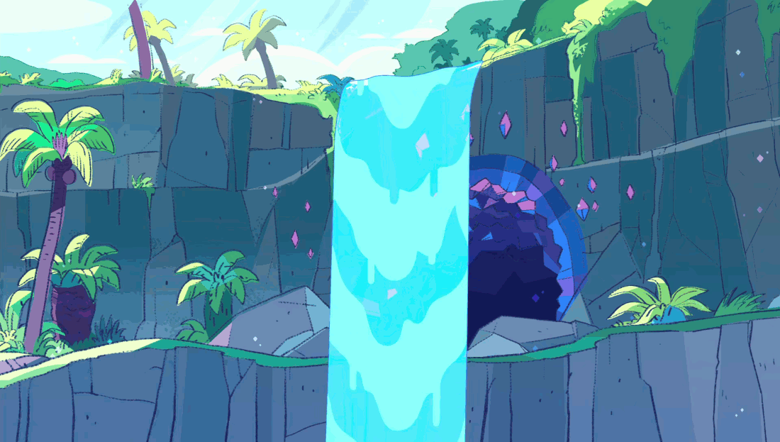
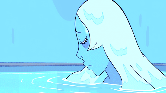
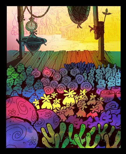
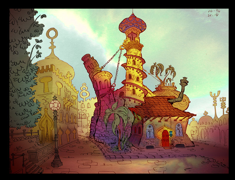
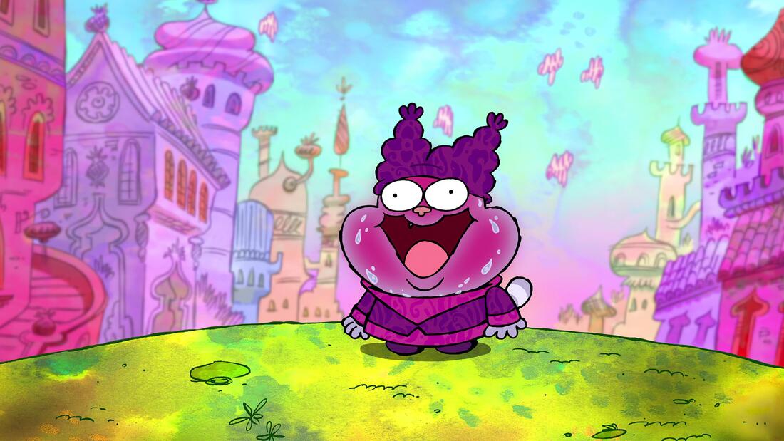
Further inspiration for the themes, characters and narrative as well as further world-building and visual inspiration.
ROBOTBOY
|
|
|
One of my biggest inspirations to date is, yet another Cartoon Network classic: Robotboy. I used to watch as a kid on the rare days I was allowed to stay up just a bit past my bedtime - it only ever aired late at night. The classic episodic slice-of-life style cartoon is my favourite format, combined with the epic robot fights and the theme of an inhuman protagonist learning how to be human, this show has everything for me.
DETROIT: BECOME HUMAN

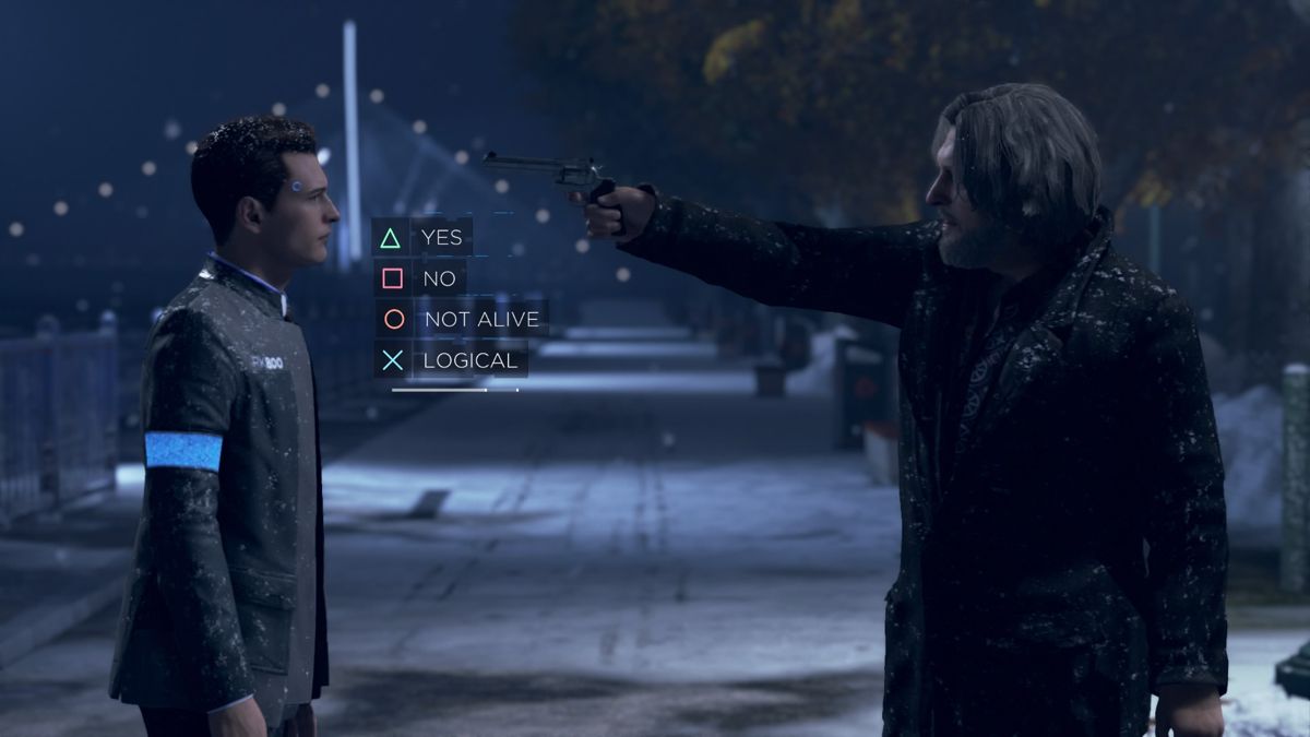


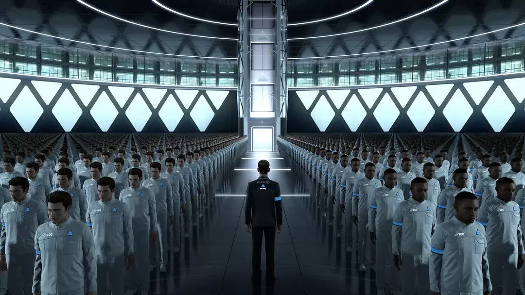
A video game I played in my teen years that has stuck with me for a long time. Detroit: Become Human is clumsy and heavy-handed in its’ execution but explores human rights issues through the lens of androids and the concept of a not-so-far-off future with technological advancements that feel less and less like science-fiction every day.
EX MACHINA


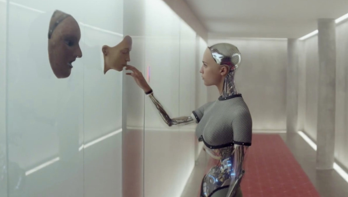
A movie with fantastic potential but, in my opinion, fumbled the bag by being completely unengaging. I got so bored while watching that I never even finished it. However, the themes it plays with and the aesthetic of the android are right up my alley.
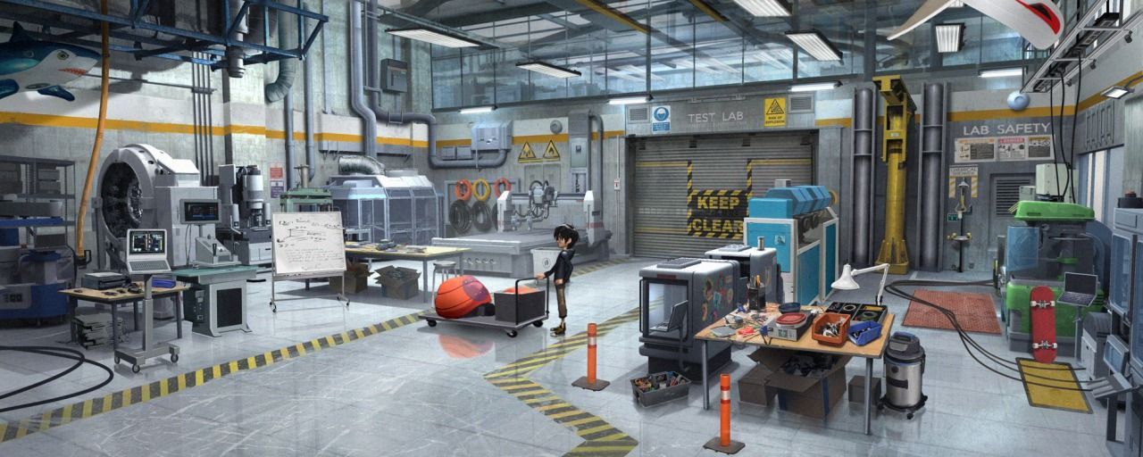
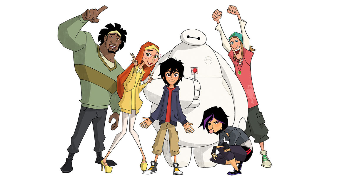
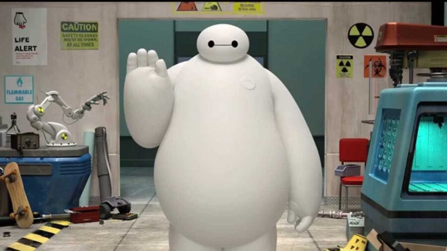
BIG HERO 6
Depiction of robotics scientists and the completely unique yet harmonious character designs, all very inspirational to me.


CHARACTER DESIGN
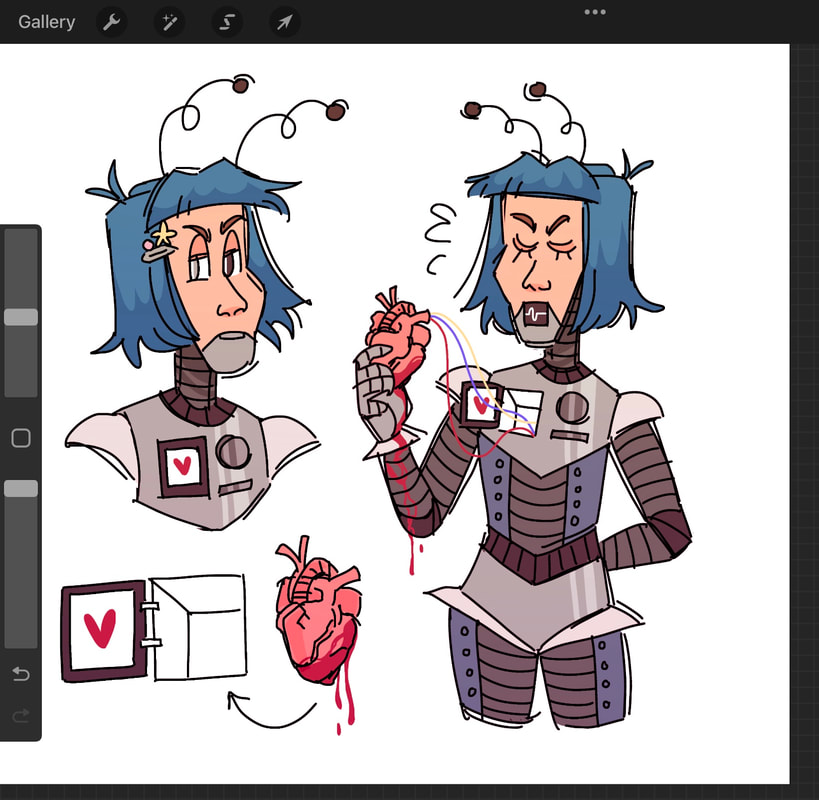
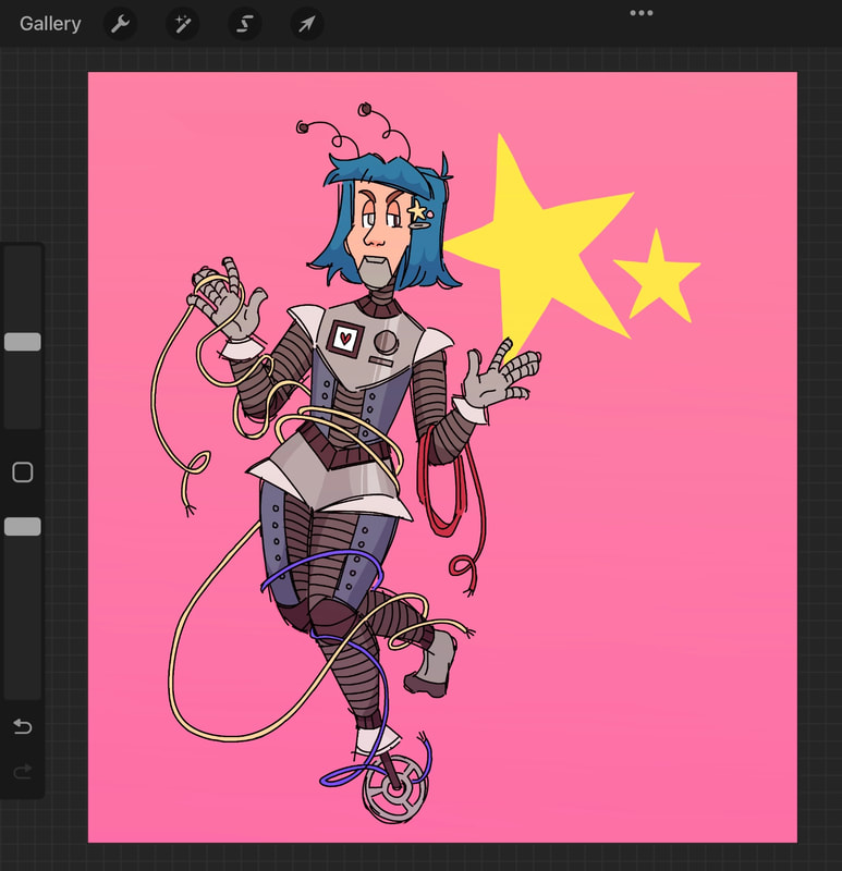
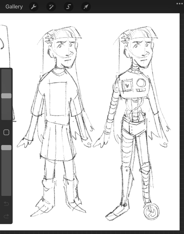
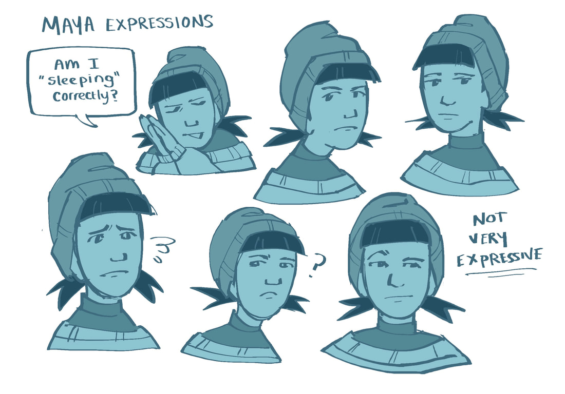
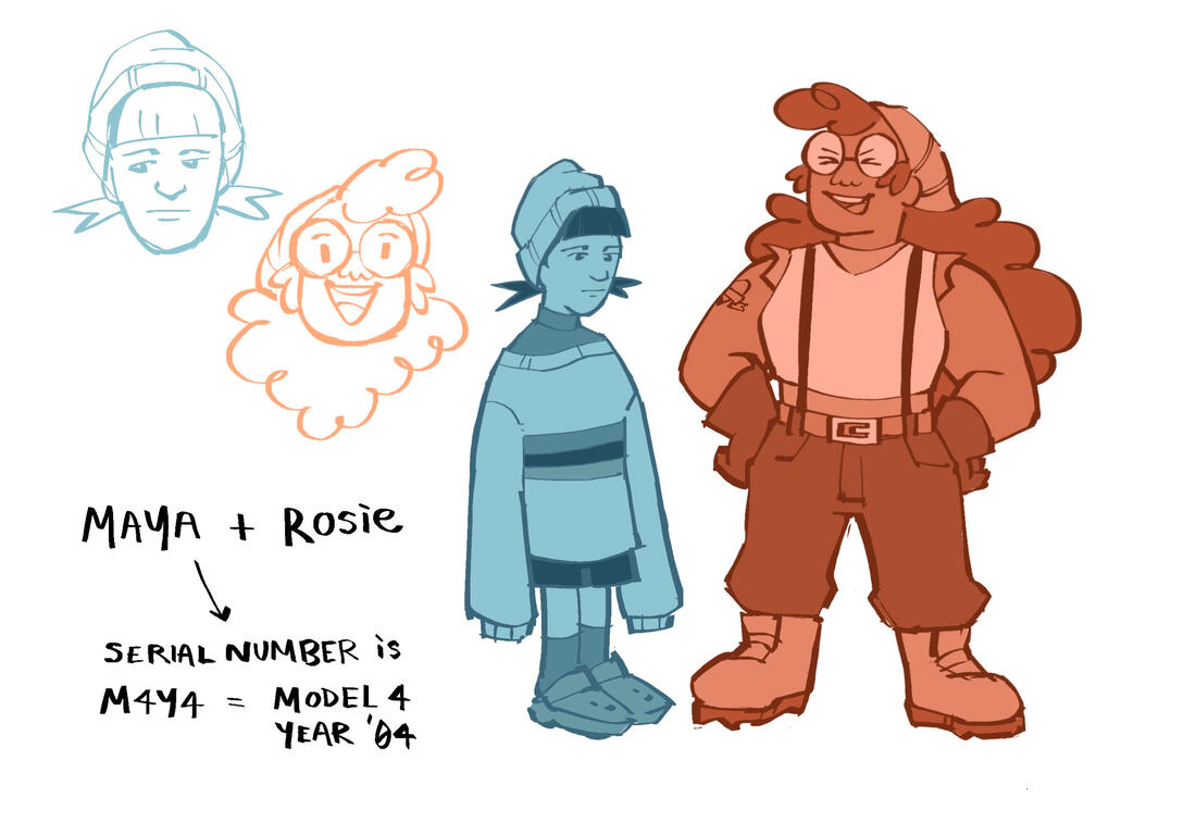
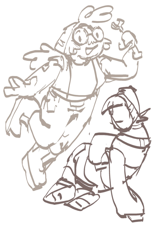
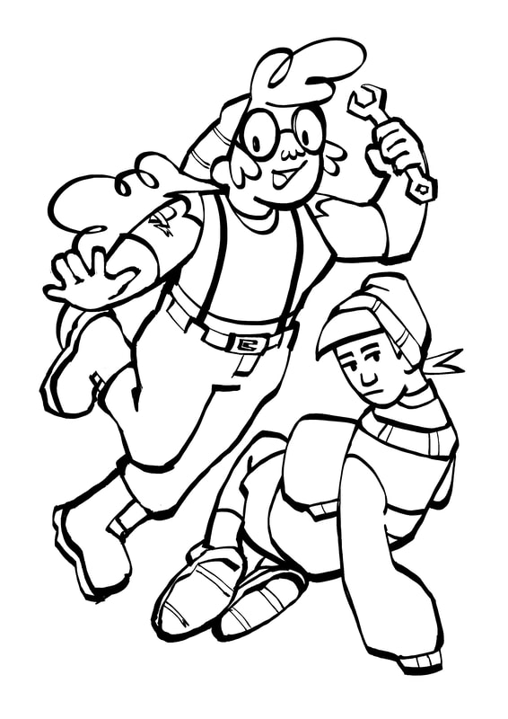
Protagonist / "M4YA"


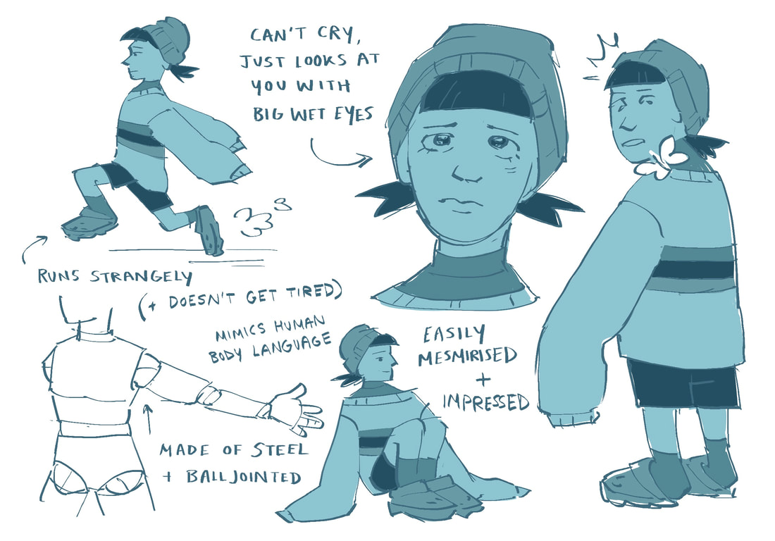

Literally a computer navigating a human world. Cautious and often confused. One of the first "emotions" she feels is an emotion that can only be described as fear - self preservation. Is not human so does not display human symptoms of fear/anxiety. Does not have a big range of expressions.
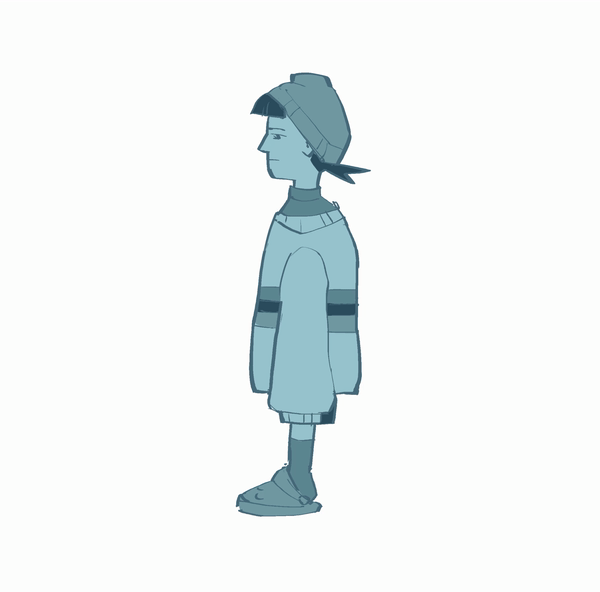
Deuteragonist / "ROSIE"
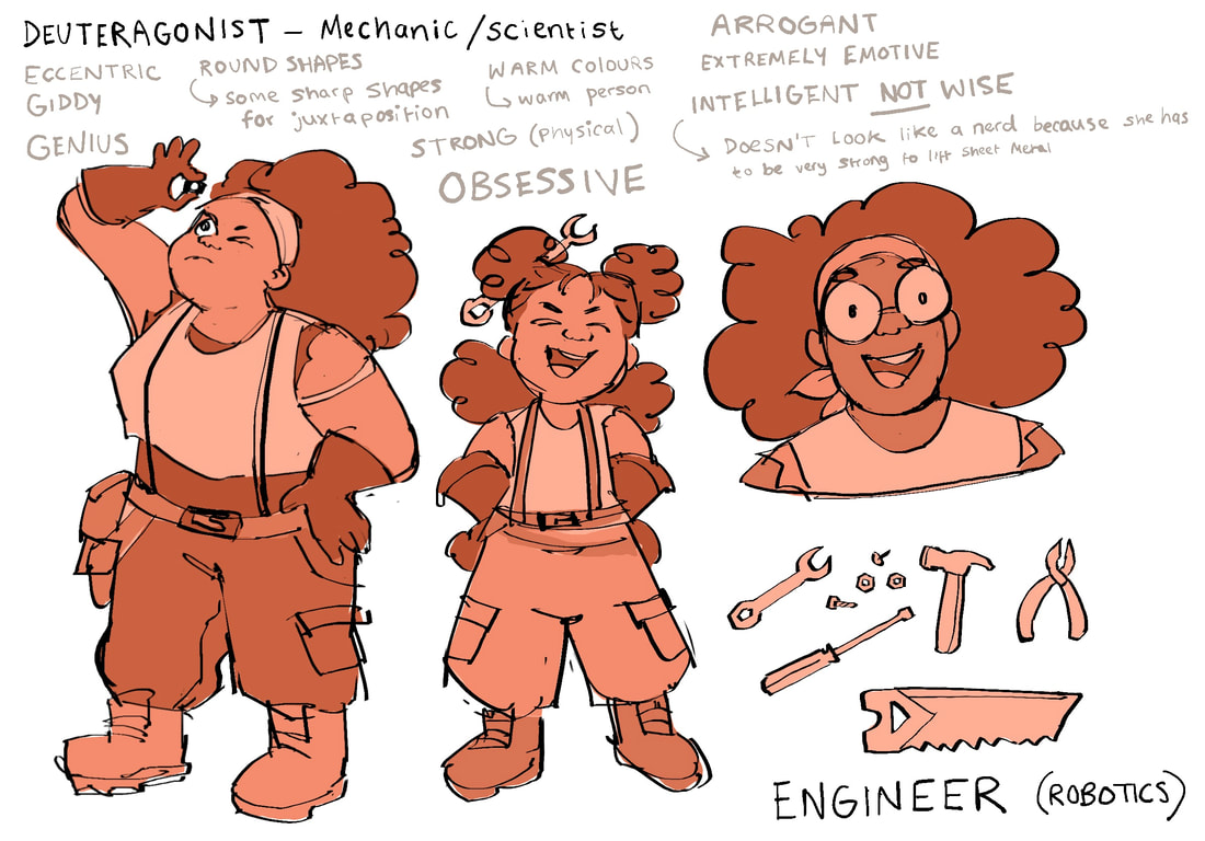
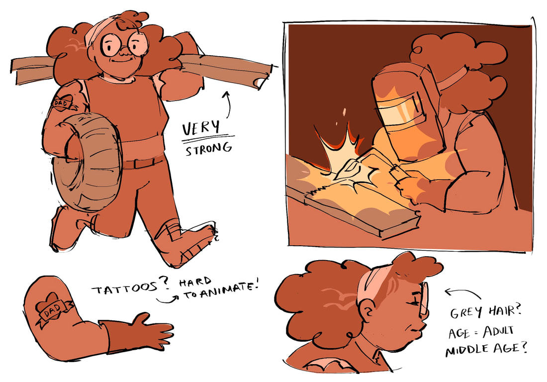


Ironic - character who spends a lot of time developing practical technology and feats of modern engineering, but is ultimately a luddite when it comes to modern online culture. The type to have a deep understanding of a computer’s innards and how it physically works, but still uses a flip phone and whose only social media account is Facebook.
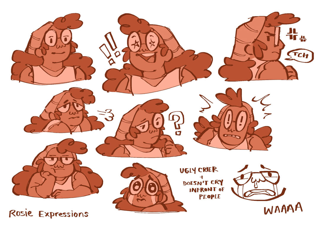
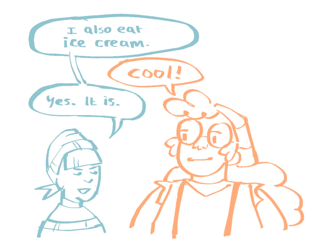
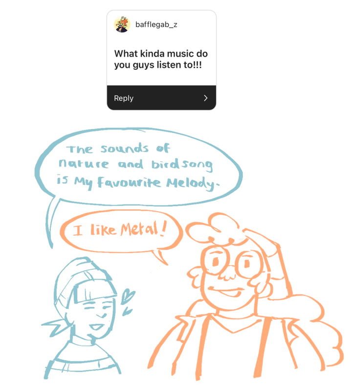
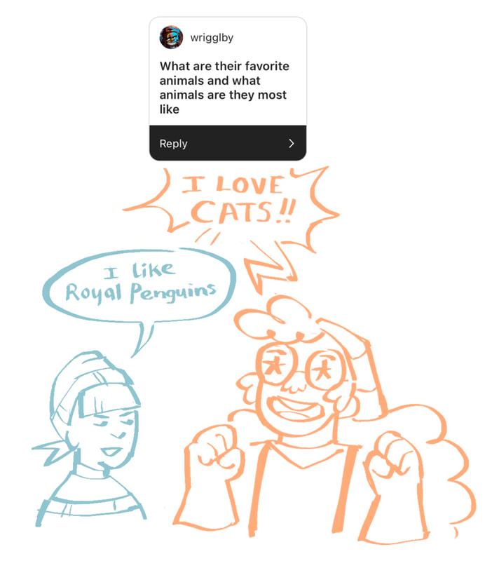
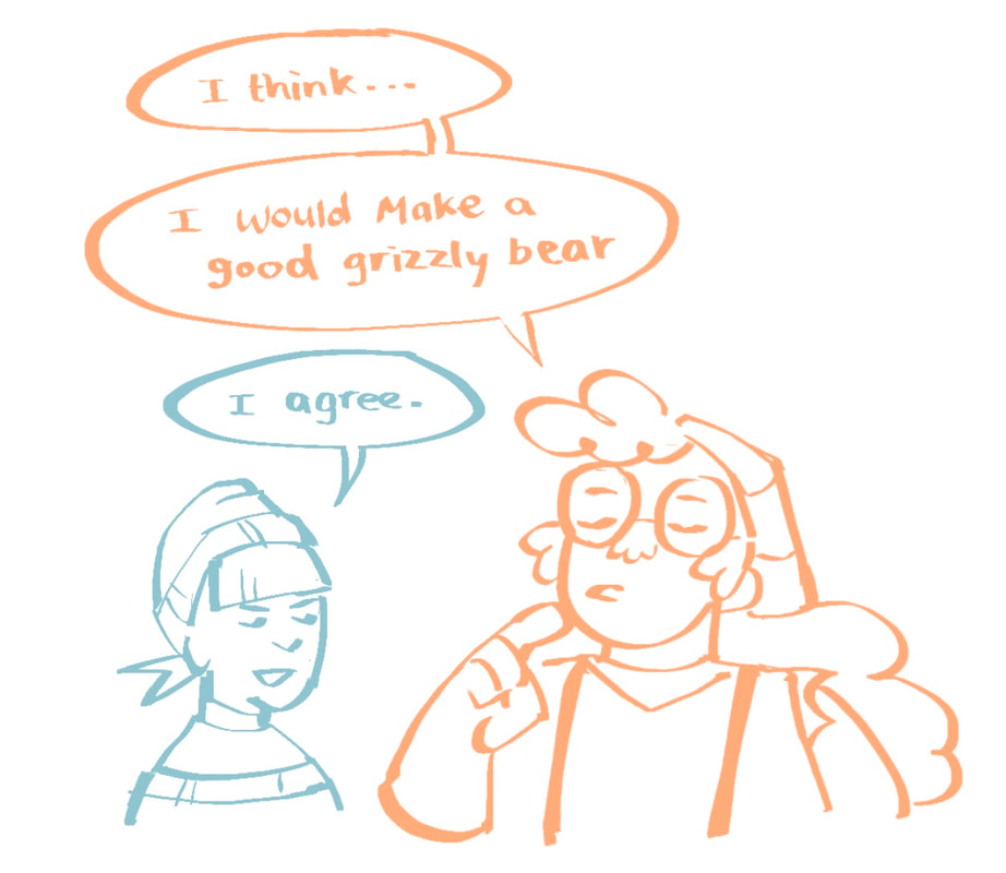
Character Q&A on Instagram
I did a small Q&A on my Instagram story where my followers could ask my characters questions. This helped me develop their personalities and the way they might visually react to situations in the story.


ENVIRONMENT / BACKGROUND
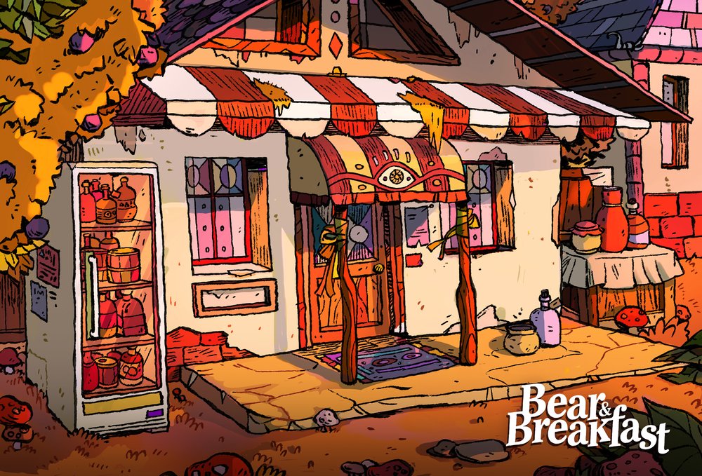
BEAR & BREAKFAST (Ioana Sopov)


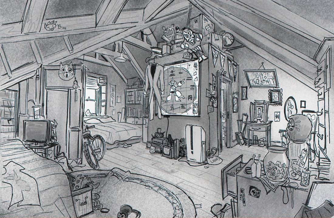
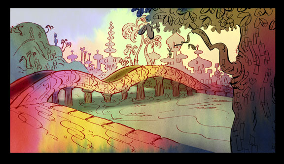
CHOWDER
Backgrounds are hand inked on paper and by one artist and then colour is added by another artist. Artists were encouraged to keep organic, "messy" lines. Contrasts with the characters made digitally in Illustrator and reflects the jarring quirkiness of the show.


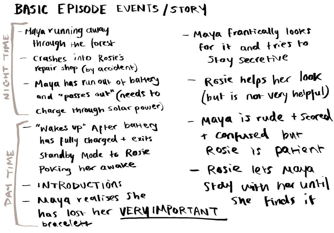
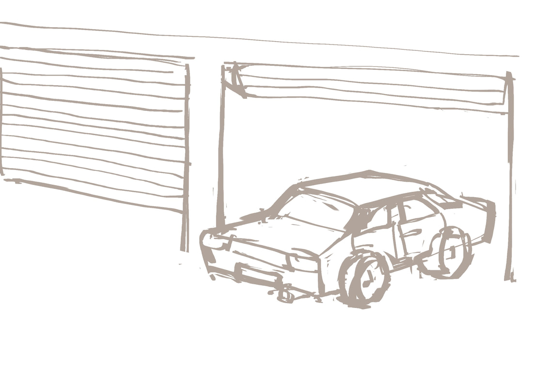
Exploring ideas for the mechanic shop in "Lost and Found"
As one of the key settings in the story, it is important to draw it out and create an understanding of the scene as a three-dimensional place for the characters to inhabit and interact with.


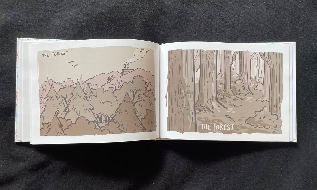
I wanted the world these characters live in to feel grounded and familiar whilst also not-quite making sense with slightly warped perspective and my characteristically unsophisticated style. I hoped to create the feeling that while this fantasy world looks and acts very closely to our own, there is something unmistakably Wrong with it. Something I want to explore is the colour palette for the background, as I want everything to be grey monochrome to contrast vividly with the characters’ orange and blue monochrome. I want the characters to feel separate and excluded from their environment, and drastically different to each other (literally complementary colours, on opposite sides of the colour wheel) but they can still relate to each other due to the fact that they’re both so separated from the world around them - both visually and in the plot of the story.
FURTHER DEVELOPMENT
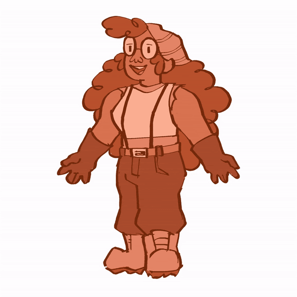
I drew the characters a few more times, experimenting with their “real” colour palettes and what they might look like in their environments. This helped me practice drawing them and becoming familiar with their designs as well as just having fun making art.


Rosie and Maya hanging out at the garage. In my mind, this is shortly after Rosie pulled the car into the shop and haphazardly parked it. They both got out and immediately crashed to the ground, as they were exhausted from a few hours of frantically searching the surrounding area for Maya’s missing bracelet.


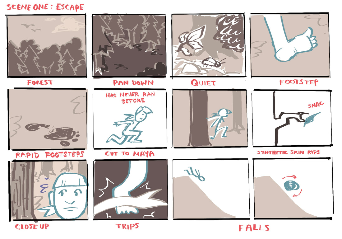
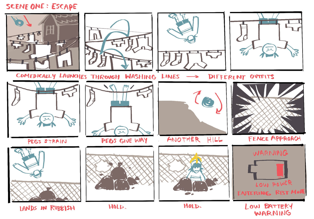
STORYBOARD
Run time will be approximately 3 mins.
LOGO / TITLE CARD / OPENING
I looked at the logo designs for cartoons/animated shows aimed at different audiences.


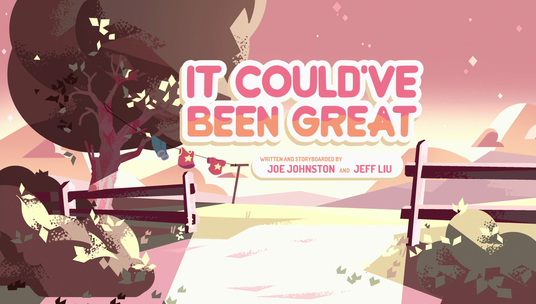
STEVEN UNIVERSE TITLE CARDS


ADVENTURE TIME TITLE CARDS


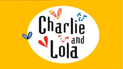
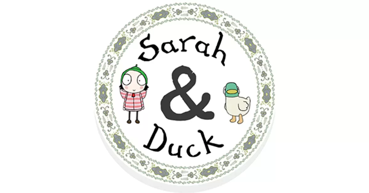
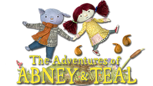
MY FAVOURITE CARTOON NETWORK OPENINGS
|
|
|
|
Experimenting with a title/logo for the opening scene.


I did some very rudimentary animation using the text to get a feel for the movement I wanted.


I storyboarded the intro animation.
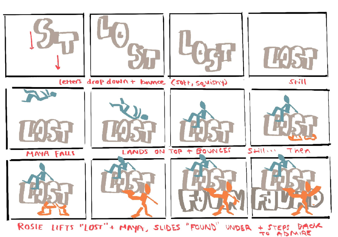
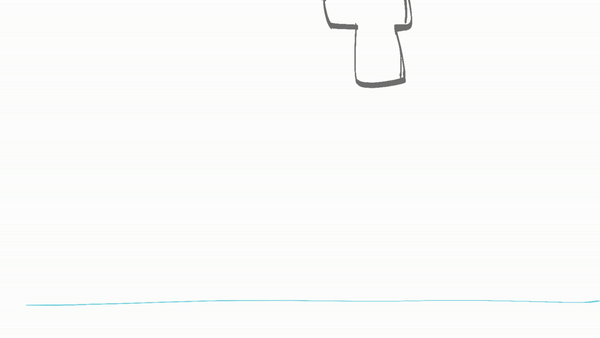
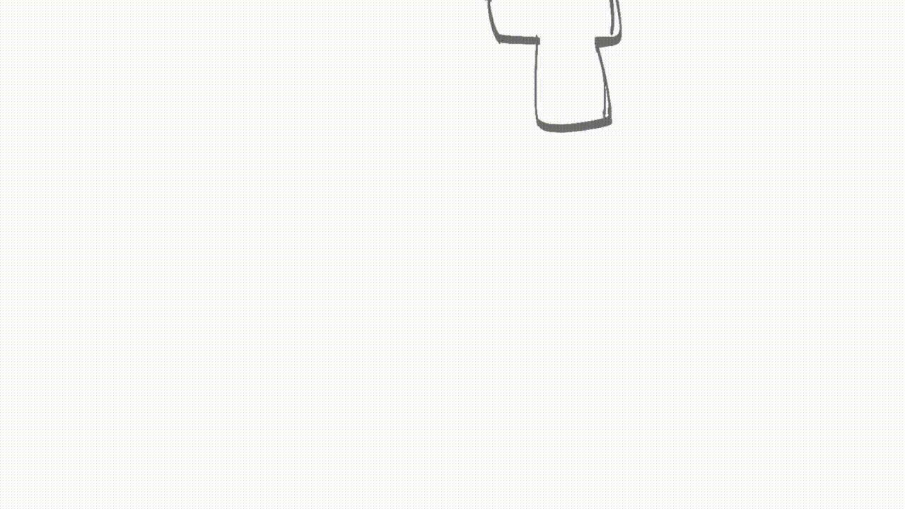
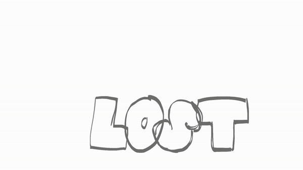
I started animating the letters of the word “Lost”. I wanted to communicate their weight and texture through their movement as they hit the ground, both for visual interest and to give the impression of a soft landing when Maya falls onto them.
I completed the full length rough animation, paying attention to the timing. The runtime for the final animation should be approximately 23 seconds.
I then went back through the rough animation and identified areas that needed improvement or revision. For this section of the animation, I feel the movement is still too stiff, I need to revise and make Maya more rigid (she is made of metal) and the letters more bouncy.
FINAL ANIMATION (TITLE SEQUENCE)
ARTBOOK
I decided to present all the work I did in development for my animation as an artbook, inspired by the ones I own for some of my favourite animated shows and movies


PLANNING
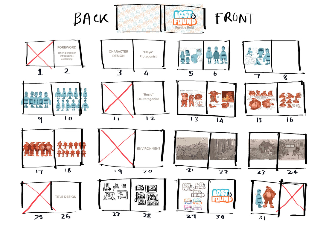
MAKING THE COVER
I wanted to keep the cover simple and clean to reflect my art style. I decided to make a repeating pattern that would wrap around the whole cover. I used adobe illustrator to create a repeating seamless pattern.
|
|

|

PRINTING
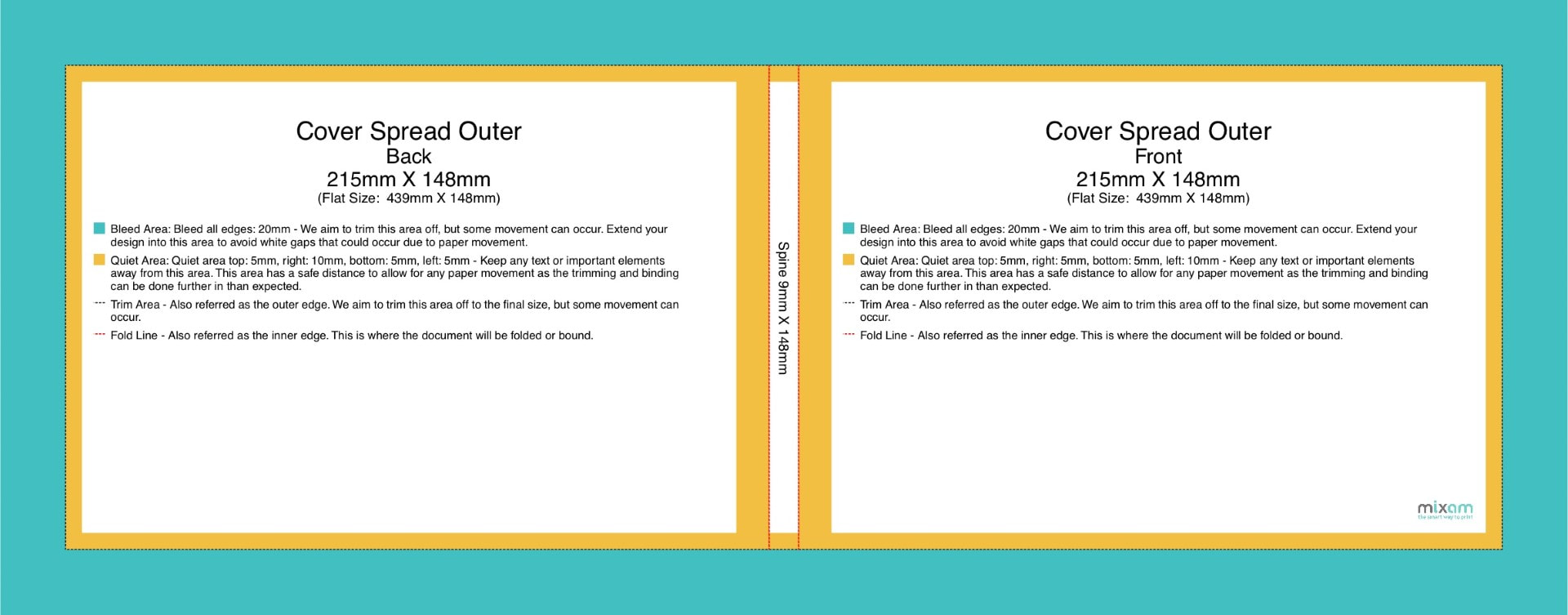

I made a mockup of the book using the Mixam preview feature.


ANIMATING
I decided to animate a head turn with both characters and attempt to show their personality through the movement.


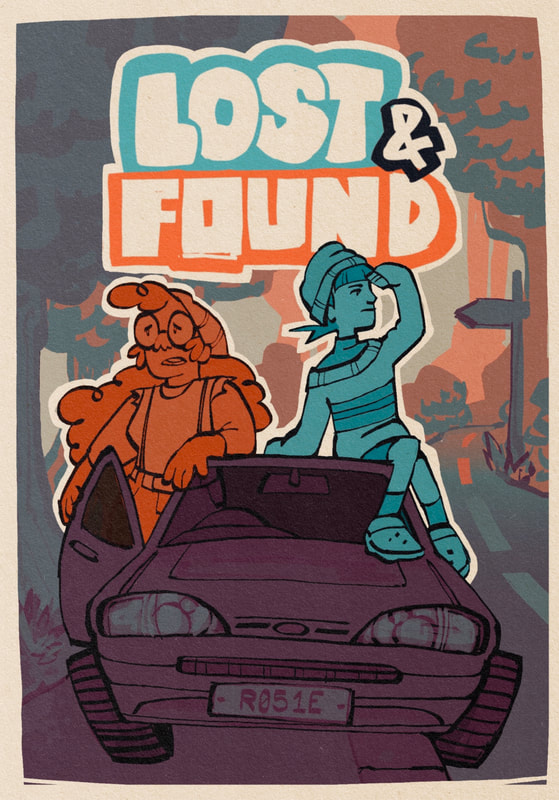
PROMO POSTER
When getting stuck on a tricky part of the animation, I decided to take a break and that I wanted to create a promotional poster/image for the hypothetical “Lost & Found” series. This could also be used as a social media post or the thumbnail cover image of the show on streaming platforms like Netflix or Disney+.